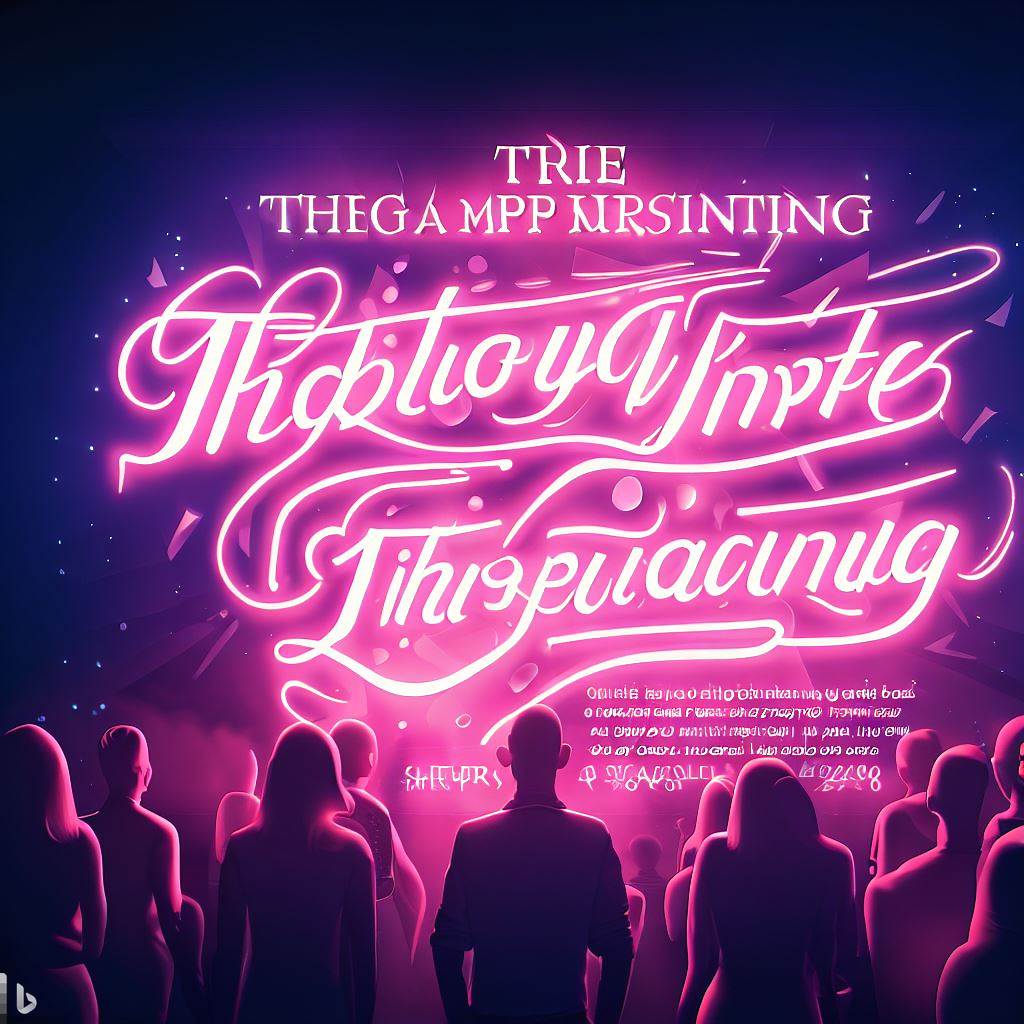
Typography is a powerful design element that plays a crucial role in poster design. It goes beyond merely selecting fonts; it involves the thoughtful arrangement, styling, and integration of type to convey messages, evoke emotions, and capture viewers’ attention. In this article, we will explore the importance of typography in poster design, its impact on visual communication, and how it contributes to creating captivating and effective posters.
Within the realm of blogging, it is undeniable that content holds a position of utmost importance. Nevertheless, the manner in which said content is presented assumes a considerable role in captivating readers’ interest and delivering a truly captivating and immersive experience. One aspect that often goes unnoticed but remains absolutely vital within the realm of blog design is typography – the artistic and technical practice of organizing typefaces. Typography encompasses a realm that expands beyond mere font selection; it entails the meticulous choice, arrangement, and utilization of type in order to heighten legibility, effectively convey brand identity, and elicit profound emotional responses. In the subsequent discourse, we shall delve into the significance of typography within the sphere of blog design, and examine how it can exert a profound influence upon the overall triumph of your blog. Continue reading The Power of Typography in Blog Design: Enhancing the Digital Reading Experience
Choosing the right typeface is a crucial decision in design, and understanding when to use serif and sans serif fonts is an essential part of that process. In this article, we will explore the characteristics and appropriate usage scenarios for both serif and sans serif fonts. By understanding their unique qualities and considering factors such as readability, tone, and context, designers can make informed decisions and create visually effective typography.
Serif Fonts:
Serif fonts are characterized by small decorative flourishes or “serifs” at the ends of strokes. They convey a sense of tradition, elegance, and formality. Here are some instances where serif fonts are commonly used:
Print Media: Serif fonts have a long history of use in print media, such as newspapers, books, and magazines. Their legibility and readability make them suitable for extended reading.
Formal Documents: Serif fonts are often preferred in formal documents, such as resumes, business letters, and legal contracts, as they add a touch of professionalism and convey a sense of authority.
Branding with Classic Appeal: Brands that want to evoke a sense of heritage, reliability, or tradition may opt for serif fonts. They can be effective for luxury brands, upscale restaurants, or institutions that value a classic aesthetic.
Examples of Serif fonts
Times New Roman: Times New Roman is one of the most widely recognized serif fonts. It has a classic, elegant appearance and is often used in traditional print media such as newspapers, books, and academic documents.
Georgia: Georgia is a serif font that was specifically designed for digital screens. It offers excellent legibility even at smaller sizes, making it a popular choice for websites and online publications.
Garamond: Garamond is a timeless serif font known for its elegance and readability. It has a delicate and refined look, making it suitable for various applications, including book typography, high-end branding, and formal invitations.
Baskerville: Baskerville is a serif font with a rich history. It features sharp, well-defined serifs and high contrast between thick and thin strokes, giving it a distinctive and sophisticated appearance. Baskerville is often used in print design, including books, magazines, and luxury branding.
Caslon: Caslon is a classic serif font with a long history dating back to the 18th century. It is characterized by its moderate contrast and strong vertical stress. Caslon is widely used in editorial design, particularly for body text in books and magazines, as well as in branding for a touch of elegance and tradition.
Sans Serif Fonts:
Sans serif fonts, on the other hand, lack the decorative flourishes found in serif fonts. They offer a modern, clean, and straightforward look. Here are some scenarios where sans serif fonts are commonly used:
Digital Platforms: Sans serif fonts have gained popularity in digital environments due to their clean and legible appearance on screens. They are widely used in website design, user interfaces, and mobile applications.
Informal Communication: When conveying a more casual or contemporary tone, sans serif fonts are a suitable choice. They are commonly used in social media graphics, blog posts, and informal advertisements.
Modern Branding: Many tech startups, modern businesses, and brands aiming for a sleek and minimalistic image opt for sans serif fonts. They convey a sense of innovation, simplicity, and forward-thinking.
Examples of Sans Serif fonts
Helvetica: Helvetica is a widely recognized and versatile sans serif font known for its clean and minimalist design. It has a neutral appearance and is commonly used in various design applications, including branding, signage, and print and digital media.
Arial: Arial is a popular sans serif font that closely resembles Helvetica. It is widely available and commonly used in digital environments, such as websites, presentations, and user interfaces. Arial offers good readability at different sizes.
Futura: Futura is a geometric sans serif font known for its modern and futuristic look. It features clean lines and simple geometric shapes, making it suitable for contemporary design projects. Futura is often used in branding, advertising, and editorial design.
Gill Sans: Gill Sans is a humanist sans serif font with a distinctive and friendly appearance. It has a balanced and versatile design, making it suitable for a wide range of applications, including branding, signage, and print media.
Roboto: Roboto is a sans serif font designed specifically for digital interfaces. It was created by Google and is now widely used in Android applications and web design. Roboto offers excellent legibility on screens and has multiple weights and styles for added versatility.
Considerations and Flexibility: While serif fonts are often associated with print and formal contexts, and sans serif fonts with digital and informal contexts, it’s important to note that these guidelines are not strict rules. Designers have the flexibility to mix and match fonts to create unique visual identities. It’s crucial to consider factors such as brand personality, target audience, and the overall design concept when making font choices.
Conclusion:
Understanding when to use serif and sans serif fonts is key to effective typography. Serif fonts bring a sense of tradition and formality, making them suitable for print media and formal documents. Sans serif fonts offer a modern and clean look, ideal for digital platforms and conveying a casual tone. By considering readability, tone, context, and the specific needs of a project, designers can make informed decisions and create typography that enhances the overall visual impact and effectiveness of their designs.
A logo is an important aspect of a brand’s identity, serving as an avatar that communicates its values and personality. However, not all logos are created equal. In this article, we’ll explore some of the worst logos in history, look at design mistakes, and what we can learn from them. By analyzing these examples, we can gain valuable insight into what makes a logo successful and avoid repeating the same mistakes in our own design efforts.
Logo of the London Olympics 2012:
The London 2012 Olympics logo is famous for its jagged and messy design, which has been the subject of much criticism. Many people find it confusing and hard to decipher. The logo’s attempt to capture the energy and vibrancy of London through abstract shapes and bold colors failed, resulting in a lack of clarity and consistency. The lesson here is the importance of simplicity and clear communication in logo design. Continue reading The worst logo in history: learn from design mistakes
Choosing the right typeface is an important aspect of design that has a significant impact on readability, aesthetics, and overall communication effectiveness. With so many fonts available today, choosing the right typeface can be overwhelming. This article serves as a guide to help you navigate the process of choosing an appropriate font for your project. By considering factors such as context, readability, style, and brand identity, you can make informed decisions to improve the visual impact and effectiveness of your design.
Understanding the context
Before diving into specific typefaces, it is essential to understand the context in which the typeface will be used. Consider your design medium, audience, and purpose. Different contexts may require different levels of form, readability, or expressiveness. For example, a formal document might require a traditional serif font, while a modern website might benefit from a clean and flexible sans serif font.
Readability and legibility
Readability and legibility are fundamental aspects of choosing the right typeface. Readability refers to the ease with which individual characters can be distinguished, while readability refers to the overall comfort and ease of reading a block of text. Consider factors such as letter spacing, x-height, stroke contrast, and ascending/descending when assessing readability. Fonts with open and spacious letterforms, well-proportioned proportions, and clear distinctions between characters tend to provide a greater degree of legibility and legibility.
Matching style and tone
The style and tone of your project should match the chosen typeface. Different typefaces evoke specific emotions and convey distinct personalities. For example, serif fonts often exude a traditional feel, while sans serif fonts are considered modern and clean. Decorative and decorative fonts add a touch of elegance or playfulness. Consider the message you want to convey and choose a typeface that complements the desired style and tone.
Consistent with brand identity
When choosing a typeface for branding purposes, it is important to maintain consistency with the brand identity. The font chosen should reflect and reinforce the personality, values, and positioning of the brand. If the brand has an established visual identity system, consult its guide to recommended typefaces. Consistency in font use across different brand touchpoints, such as logos, websites, and marketing materials, helps establish brand recognition and build credibility.
Consider practical factors
Practical considerations should also play a role in the choice of typeface. Consider intended use and design constraints. For example, if the design will be printed at a small size, choose a typeface that has good readability at a small scale. If the design will be used on different devices and screen sizes, choose a font that is optimized to be readable on the screen. Also, review font availability and licensing, making sure you have the necessary permissions and permissions.
Conclusion
Choosing the right typeface is an important decision that can have a significant impact on the success of your design. By considering context, readability, style, brand identity, and practical elements, you can make informed choices to improve your project’s visual appeal and effectiveness. Remember that typography is a powerful communication tool, and choosing the right typeface ensures that your message is delivered clearly, consistently, and with impact. Take the time to explore different options, test readability, and ask for feedback to ensure that the typeface you’ve chosen perfectly matches your design goals.
The history of human communication is marked by a profound evolution from oral traditions to the complex systems of writing that enable the preservation and transmission… Read more: The Origins of Writing and Early Alphabets