In today’s digital age, fonts play a crucial role in design and communication. They have the power to evoke emotions, convey messages, and create a lasting impression. With countless fonts available, it can be overwhelming to choose the right one for your project. In this article, we will explore the most popular font styles that have stood the test of time and examine the worst font styles to avoid. Whether you are a designer, writer, or simply someone interested in typography, this guide will provide valuable insights into the world of fonts.
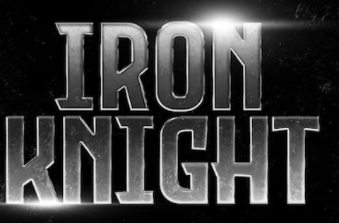
Movie titles are a crucial element in the overall design of a film. They not only convey the title of the movie but also set the tone and create anticipation for what’s to come. Fonts play a significant role in the design of movie titles, as they can evoke emotions, convey themes, and capture the essence of the film. In this article, we will explore the importance of font design for movie titles, the main characteristics that must be met, and the impact they have on the overall poster. Fonts play a crucial role in the world of movie titles, where certain typefaces have gained iconic status and have become synonymous with the film industry. These fonts have stood the test of time and have adorned numerous successful movie posters. Among the most popular choices is Helvetica, renowned for its clean and modern appearance. With its versatility, Helvetica suits a wide range of genres, from romantic comedies to action-packed thrillers.
The selection of a font for a movie title depends on several factors, including the genre, target audience, and overall poster design. It is crucial to choose a font that aligns with the film’s theme and effectively communicates its essence to the audience. However, not all fonts are suitable for movie titles. Some should be avoided as they can undermine the overall impact of the poster and fail to capture the attention of the audience.
The Most Popular Fonts for Movie Titles
When it comes to movie titles, certain fonts have become iconic and synonymous with the film industry. These fonts have stood the test of time and have been used in numerous successful movie posters. One such font is Helvetica, known for its clean and modern look. Helvetica is versatile and can be used for a variety of genres, from romantic comedies to action-packed thrillers.
Another popular font choice is Trajan, which is often associated with historical or epic films. Its classical and timeless appearance adds a sense of grandeur and importance to the movie title. Other fonts that have gained popularity include Gotham, Futura, and Univers. These fonts are characterized by their simplicity and legibility, making them suitable for a wide range of movie genres.
The choice of font for a movie title depends on various factors such as the genre, target audience, and the overall design of the poster. It is essential to select a font that aligns with the movie’s theme and effectively communicates its essence to the audience.
The Worst Fonts for Movie Titles
While certain fonts have become iconic in the movie industry, there are others that should be avoided when designing movie titles. These fonts can detract from the overall impact of the poster and fail to capture the attention of the audience.
Comic Sans is one such font that should be avoided at all costs. Although it may be suitable for casual or lighthearted contexts, it is not appropriate for movie titles as it lacks the sophistication and professionalism required. Another font to avoid is Papyrus, which gained notoriety for its excessive use in the movie Avatar. Papyrus is considered overused and cliché, giving a generic and uninspired look to movie titles.
When designing movie titles, it is crucial to steer clear of fonts that are difficult to read or are overly decorative. Fonts such as Curlz MT or Jokerman may be visually appealing, but they can be challenging to decipher and detract from the overall impact of the poster.
Conclusion
In conclusion, the design of fonts for movie titles plays a vital role in capturing the attention of the audience and setting the tone for the film. The choice of font can evoke emotions, convey themes, and create anticipation for what’s to come. Popular fonts such as Helvetica and Trajan have become iconic in the movie industry, while fonts like Comic Sans and Papyrus should be avoided. When designing movie titles, it is essential to consider the genre, target audience, and overall design of the poster to select a font that effectively communicates the essence of the film.
Next time you watch a movie, take a moment to appreciate the thought and effort put into the design of its title. Fonts may seem like a minute detail, but they have a significant impact on the overall poster and the audience’s perception of the film. So, whether it’s a romantic comedy, an action-packed thriller, or a thought-provoking drama, remember that the font choice is not just about aesthetics but a powerful tool in capturing the essence of the story.
The percent sign (%) is a symbol that carries a significant history, originating in 16th-century Italy. It is derived from the Latin term “per centum,” meaning “out of one hundred.” Initially written as “per cento,” the symbol underwent modifications over time, ultimately becoming the familiar percentage sign we recognize today. Widely used in various countries, the percent sign represents fractions of one hundred and is employed in contexts such as mathematics, statistics, and finance. This essay delves into the intriguing evolution and versatility of the percent sign, shedding light on its global adoption and enduring relevance. Continue reading The Percent Sign: A Symbol of Ratios and Proportions
Typography, as a fundamental element of visual communication, is not immune to the influence of cultural trends. In this article, we will delve into the fascinating realm of contemporary typography and examine how cultural trends in art shape and redefine typographic expressions. In today’s rapidly changing world, where globalization, digitalization, and diverse cultural influences intersect, typography serves as a powerful vehicle for cultural representation, self-expression, and societal commentary.
Contemporary art movements and cultural trends have a significant impact on the evolution of typography. Artists, designers, and typographers draw inspiration from the dynamic landscape of contemporary art, integrating its concepts, aesthetics, and philosophies into the design of typefaces. Typography has become a medium for reflecting and responding to the cultural shifts and diverse perspectives of our time. Continue reading The Influence of Cultural Trends on Typography
The @ symbol, a ubiquitous symbol in our digital era, carries a captivating history that stretches back centuries. Originating as a shorthand for the word “at,” it has evolved from its humble beginnings to become an essential component of email addresses, social media handles, and website URLs. The symbol’s journey encompasses intriguing facts, cultural variations in nomenclature, and even its artistic applications. This essay delves into the captivating history and significance of the @ symbol, exploring its transformative role in connecting people, facilitating communication, and fostering creative expression.
The @ symbol has a rich and fascinating history that stretches back centuries. Originating in the 16th century, it emerged as a shorthand for the word “at.” Initially, it was written as a lowercase “a” with a superscript “t,” but over time, it underwent transformations to become the familiar @ symbol we know today. Continue reading The History and Significance of the @ Symbol
The history of human communication is marked by a profound evolution from oral traditions to the complex systems of writing that enable the preservation and transmission… Read more: The Origins of Writing and Early Alphabets