Typography is an essential element of design that plays a crucial role in conveying information effectively. Whether it’s a website, a book, or a poster, selecting the right fonts and understanding the principles of typography can greatly enhance the readability and visual appeal of any text. In this article, we will delve into the fundamentals of typography, exploring the anatomy of letters, the structure of fonts, and the principles of readability and legibility.
Typography plays a crucial role in design, enhancing the overall visual appeal and readability of a piece. In today’s fast-paced world, where attention spans are dwindling, choosing the right font has become more important than ever. In this article, we will explore the most popular typography trends, current styles, aesthetics, and techniques that are shaping the design landscape. Whether you are a designer, marketer, or simply interested in the world of fonts, this article will provide valuable insights into the evolving world of typography.
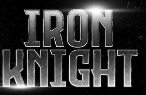
Movie titles are a crucial element in the overall design of a film. They not only convey the title of the movie but also set the tone and create anticipation for what’s to come. Fonts play a significant role in the design of movie titles, as they can evoke emotions, convey themes, and capture the essence of the film. In this article, we will explore the importance of font design for movie titles, the main characteristics that must be met, and the impact they have on the overall poster. Fonts play a crucial role in the world of movie titles, where certain typefaces have gained iconic status and have become synonymous with the film industry. These fonts have stood the test of time and have adorned numerous successful movie posters. Among the most popular choices is Helvetica, renowned for its clean and modern appearance. With its versatility, Helvetica suits a wide range of genres, from romantic comedies to action-packed thrillers.
The selection of a font for a movie title depends on several factors, including the genre, target audience, and overall poster design. It is crucial to choose a font that aligns with the film’s theme and effectively communicates its essence to the audience. However, not all fonts are suitable for movie titles. Some should be avoided as they can undermine the overall impact of the poster and fail to capture the attention of the audience.
The Most Popular Fonts for Movie Titles
When it comes to movie titles, certain fonts have become iconic and synonymous with the film industry. These fonts have stood the test of time and have been used in numerous successful movie posters. One such font is Helvetica, known for its clean and modern look. Helvetica is versatile and can be used for a variety of genres, from romantic comedies to action-packed thrillers.
Another popular font choice is Trajan, which is often associated with historical or epic films. Its classical and timeless appearance adds a sense of grandeur and importance to the movie title. Other fonts that have gained popularity include Gotham, Futura, and Univers. These fonts are characterized by their simplicity and legibility, making them suitable for a wide range of movie genres.
The choice of font for a movie title depends on various factors such as the genre, target audience, and the overall design of the poster. It is essential to select a font that aligns with the movie’s theme and effectively communicates its essence to the audience.
The Worst Fonts for Movie Titles
While certain fonts have become iconic in the movie industry, there are others that should be avoided when designing movie titles. These fonts can detract from the overall impact of the poster and fail to capture the attention of the audience.
Comic Sans is one such font that should be avoided at all costs. Although it may be suitable for casual or lighthearted contexts, it is not appropriate for movie titles as it lacks the sophistication and professionalism required. Another font to avoid is Papyrus, which gained notoriety for its excessive use in the movie Avatar. Papyrus is considered overused and cliché, giving a generic and uninspired look to movie titles.
When designing movie titles, it is crucial to steer clear of fonts that are difficult to read or are overly decorative. Fonts such as Curlz MT or Jokerman may be visually appealing, but they can be challenging to decipher and detract from the overall impact of the poster.
Conclusion
In conclusion, the design of fonts for movie titles plays a vital role in capturing the attention of the audience and setting the tone for the film. The choice of font can evoke emotions, convey themes, and create anticipation for what’s to come. Popular fonts such as Helvetica and Trajan have become iconic in the movie industry, while fonts like Comic Sans and Papyrus should be avoided. When designing movie titles, it is essential to consider the genre, target audience, and overall design of the poster to select a font that effectively communicates the essence of the film.
Next time you watch a movie, take a moment to appreciate the thought and effort put into the design of its title. Fonts may seem like a minute detail, but they have a significant impact on the overall poster and the audience’s perception of the film. So, whether it’s a romantic comedy, an action-packed thriller, or a thought-provoking drama, remember that the font choice is not just about aesthetics but a powerful tool in capturing the essence of the story.
Typeface design, often referred to as typography, is an intricate art form that involves the meticulous crafting of letters and characters. It is an essential aspect of visual communication, with profound implications for various design disciplines, including graphic design, branding, and advertising. This essay explores the fascinating world of typeface design, its historical significance, the creative process involved, and its impact on contemporary visual culture.
Modern keyboards are equipped with a variety of special characters that can be used to add emphasis, punctuation, and other special effects to text. These characters can be accessed in a variety of ways, depending on the keyboard layout and operating system.
Types of special characters
There are many different types of special characters that can be used on modern keyboards. Some of the most common types include:
Punctuation marks: These characters are used to mark the end of sentences, clauses, and phrases. Some common punctuation marks include periods, commas, semicolons, and question marks.
Symbols: These characters are used to represent ideas or concepts. Some common symbols include mathematical symbols, currency symbols, and musical symbols.
Accents: These characters are used to modify the pronunciation of letters. Some common accents include acute accents, grave accents, and tildes.
Ligatures: These characters are formed by combining two or more letters. Some common ligatures include æ, œ, and ß.
List of special characters
Here is a list of some of the most common special characters that can be used on modern keyboards:
Punctuation marks: . , ; ? ! : ” ‘
Symbols: + – * / = @ # $ % ^ & _ { } | ~
Accents: ` ´ ¨ ˆ ˜ ¯
Ligatures: æ œ ß
The origin.
Punctuation marks
. (period): The period is thought to have originated in ancient Egypt, where it was used as a decimal point.
, (comma): The comma is thought to have originated in ancient Greece, where it was used to separate clauses in a sentence.
; (semicolon): The semicolon is thought to have originated in ancient Rome, where it was used to separate independent clauses in a sentence.
? (question mark): The question mark is thought to have originated in ancient Greece, where it was used to indicate a question.
! (exclamation mark): The exclamation mark is thought to have originated in ancient Rome, where it was used to indicate surprise or emphasis.
: (colon): The colon is thought to have originated in ancient Greece, where it was used to introduce a list or quotation.
“ (quotation marks): The quotation marks are thought to have originated in ancient Greece, where they were used to indicate a direct quotation.
‘ (apostrophe): The apostrophe is thought to have originated in ancient Rome, where it was used to indicate a contraction or possession.
Symbols
+ (plus sign): The plus sign is thought to have originated in ancient Egypt, where it was used as a shorthand for the word “and.”
– (minus sign): The minus sign is thought to have originated in ancient Rome, where it was used to indicate subtraction.
* (asterisk): The asterisk is thought to have originated in ancient Greece, where it was used as a shorthand for the word “star.”
/ (division sign): The division sign is thought to have originated in ancient Babylonia, where it was used to indicate division.
= (equals sign): The equals sign is thought to have originated in ancient Greece, where it was used to indicate equality.
@ (at sign): The at sign is thought to have originated in the 16th century, when it was used as a shorthand for the word “at.”
# (number sign): The number sign is thought to have originated in ancient Rome, where it was used as a shorthand for the word “number.”
$ (dollar sign): The dollar sign is thought to have originated in the 17th century, when it was used to indicate Spanish currency.
% (percent sign): The percent sign is thought to have originated in the 18th century, when it was used to indicate a percentage.
^ (caret): The caret is thought to have originated in the 15th century, when it was used as a shorthand for the word “superscript.”
& (ampersand): The ampersand is thought to have originated in ancient Rome, where it was used as a shorthand for the word “and.”
_ (underscore): The underscore is thought to have originated in the 19th century, when it was used as a shorthand for the word “underline.”
{ (curly brace): The curly brace is thought to have originated in the 16th century, when it was used as a shorthand for the word “brace.”
} (curly brace): The curly brace is thought to have originated in the 16th century, when it was used as a shorthand for the word “brace.”
| (vertical bar): The vertical bar is thought to have originated in ancient Rome, where it was used as a shorthand for the word “or.”
~ (tilde): The tilde is thought to have originated in Spain, where it was used as a shorthand for the word “approximately.”
Accents
` (grave accent): The grave accent is thought to have originated in ancient Greece, where it was used to indicate a low tone.
´ (acute accent): The acute accent is thought to have originated in ancient Rome, where it was used to indicate a high tone.
¨ (umlaut): The umlaut is thought to have originated in Germany, where it was used to indicate a vowel sound that is pronounced with a rounded lip.
ˆ (circumflex): The circumflex is thought to have originated in France, where it was used to indicate a vowel sound that is pronounced with a rising tone.
˜ (tilde): The tilde is thought to have originated in Spain, where it was used as a shorthand for the word “approximately.”
¯ (macron): The macron is thought to have originated in ancient Greece, where it was used to indicate a long vowel sound.
Ligatures
æ (ae): The ligature æ is thought to have originated in the 10th century, when it was used to represent the sound of the two vowels “a” and “e” combined.
œ (oe): The ligature œ is thought to have originated in the 11th century, when it was used to represent the sound of the two vowels “o” and “e” combined.
ß (eszett): The ligature ß is thought to have originated in the 13th century, when it was used to represent the sound of the two consonants “s” and “z” combined.
The use of ligatures has declined in recent years, as modern keyboards do not typically include them. However, they are still used in some languages, such as Danish, Norwegian, and German.
Here are some additional information about the ligatures you mentioned:
The ligature æ is used in Danish, Norwegian, and Swedish. It is pronounced as the sound of the two vowels “a” and “e” combined.
The ligature œ is used in Danish, Norwegian, and Swedish. It is pronounced as the sound of the two vowels “o” and “e” combined.
The ligature ß is used in German. It is pronounced as the sound of the two consonants “s” and “z” combined.
This is just a small selection of the many special characters that are available on modern keyboards. For a more complete list, you can consult the Character Map utility or a reference book on typography.
Conclusion
Special characters can be a valuable tool for adding emphasis, punctuation, and other special effects to text. By understanding how to access and use special characters, you can improve the readability and impact of your writing.
The history of human communication is marked by a profound evolution from oral traditions to the complex systems of writing that enable the preservation and transmission… Read more: The Origins of Writing and Early Alphabets