Skip to navigation Skip to content
Southype
  • Shop
  • Blog
  • News
  • About Us
  • Contact Us
  • My Account
  • TOS & License Agreement
  • Home
  • About Us
  • Blog
  • Cart
  • Checkout
  • Contact Us
  • My Account
  • News
  • TOS & License Agreement
  • $0.00 0 items
Home / Logo / The worst logo in history: learn from design mistakes
Posted on June 17, 2023June 15, 2023 by Southype

The worst logo in history: learn from design mistakes

A logo is an important aspect of a brand’s identity, serving as an avatar that communicates its values ​​and personality. However, not all logos are created equal. In this article, we’ll explore some of the worst logos in history, look at design mistakes, and what we can learn from them. By analyzing these examples, we can gain valuable insight into what makes a logo successful and avoid repeating the same mistakes in our own design efforts.

Logo of the London Olympics 2012:

olympic_logo_london_2012.jpg

The London 2012 Olympics logo is famous for its jagged and messy design, which has been the subject of much criticism. Many people find it confusing and hard to decipher. The logo’s attempt to capture the energy and vibrancy of London through abstract shapes and bold colors failed, resulting in a lack of clarity and consistency. The lesson here is the importance of simplicity and clear communication in logo design.

2009 Tropicana logo redesign:
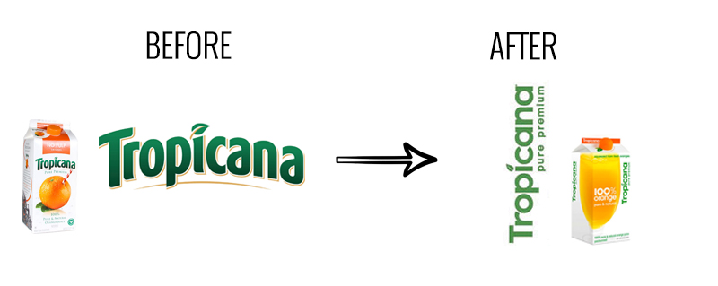
 

What to learn from Tropicana's packaging redesign failure?

Tropicana’s logo redesign in 2009 drew a strong response from consumers. The new logo, which replaces the beloved orange icon with a more generic and minimalist design, has not resonated with the brand’s loyal customers. The lesson here is the importance of maintaining brand recognition and understanding the emotional connection consumers have with established logos.


Mascots of the London 2012 Olympic Games:

The mascots of the 2012 London Olympics, named Wenlock and Mandeville, have been widely criticized for their bizarre and unattractive designs. The characters lack relativity and don’t capture the spirit of the Game. The lesson here is the importance of creating compelling mascots and characters that are connected and associated with the event or brand they represent.

Melbourne City Logo 2009:

The redesign of the City of Melbourne logo in 2009 was met with backlash. The complex and abstract design, inspired by the shape of a boomerang, was perceived as confusing and lacking in alignment with the city’s identity. The lesson here is to ensure that logos are not only visually appealing, but also relevant and meaningful to the entity they represent.


Gap 2010 logo redesign:

Gap’s 2010 logo redesign received immediate negative feedback. The change from the iconic blue box icon to simple black text on a white background has caused outrage among consumers. The backlash caused Gap to revert to its original logo within days. The lesson here is to approach logo redesigns with caution and consider the strong emotional attachment that consumers can have for an existing logo.


Conclusion:

Reviewing the worst logos in history offers valuable logo design lessons. Simplifying designs, maintaining brand recognition, creating relevant individuals, ensuring entity relevance, and addressing consumer engagement are key considerations. As designers, we can learn from these mistakes and strive to create symbols that effectively communicate the brand’s values, resonate with consumers, and last forever. time. By understanding the elements of successful logo design and avoiding the pitfalls of the past, we can elevate our own work and help create impressive and memorable visual identities.

facebookShare on Facebook
TwitterTweet
FollowFollow us
PinterestSave

Related posts:

  1. Designing a Logo with Typography: A Comprehensive Guide
  2. The Art of Typeface Design for Logos: A Perfect Blend of Creativity and Brand Identity
  3. Choosing the right typeface: A guide to choosing the right font
  4. How to Choose the Right Typography for Your Logo Design
  5. Common Mistakes in Logo Design: 10 Typography Errors to Avoid
  6. The Impact of Typography on Brand Identity: Creating a Distinctive Visual Language
Category: Logo
Tag: Logo

Post navigation

Previous post: Choosing the right typeface: A guide to choosing the right font
Next post: Understanding When to Use Serif and Sans Serif Fonts

Something to Read... Latest Post

  • Modern Typefaces: The Didone Style and the Rise of Typographic Precision
    The evolution of typography reached a significant turning point at the end of the eighteenth century with the emergence of the Modern typefaces, often referred to… Read more: Modern Typefaces: The Didone Style and the Rise of Typographic Precision
  • Baroque and Transitional Typefaces: Bridging Ornament and Rationality in the Evolution of Typography
    The progression of typography from the Renaissance into the Baroque and Transitional periods reflects not only aesthetic evolution but also the deepening cultural, political, and scientific… Read more: Baroque and Transitional Typefaces: Bridging Ornament and Rationality in the Evolution of Typography
  • Typography of the Renaissance: The Humanist Typefaces
    The Renaissance period marked a profound transformation in European culture, art, and intellectual life. Often characterized as a revival of classical knowledge, the Renaissance was not… Read more: Typography of the Renaissance: The Humanist Typefaces
  • The Origins of Writing and Early Alphabets
    The history of human communication is marked by a profound evolution from oral traditions to the complex systems of writing that enable the preservation and transmission… Read more: The Origins of Writing and Early Alphabets
  • El toro mecánico: la atracción ideal para eventos inolvidables
    Cuando se trata de organizar un evento, uno de los mayores desafíos es encontrar una actividad que conecte con todos los asistentes. Algo que no solo… Read more: El toro mecánico: la atracción ideal para eventos inolvidables
Categories
  • Decorative
  • dingbats
  • Eroded
  • Fancy
  • Free
  • Free for any use
  • holiday
  • horror
  • Sans
  • Script
  • tech
  • Uncategorized
Menu
  • Shop
  • Blog
  • News
  • About Us
  • Contact Us
  • My Account
  • TOS & License Agreement
Ads
Contact Us
  • Email
    southype@gmail.com

Latest Post

  • Modern Typefaces: The Didone Style and the Rise of Typographic Precision
  • Baroque and Transitional Typefaces: Bridging Ornament and Rationality in the Evolution of Typography
  • Typography of the Renaissance: The Humanist Typefaces
© Southype 2025
Built with WooCommerce.
  • My Account
  • Search
  • Cart 0
RSS
Follow by Email
Facebook
Facebook
fb-share-icon
Instagram