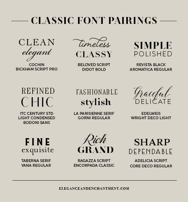
Typography is an art form that goes beyond selecting a single font. Pairing fonts is a skill that can greatly enhance the visual appeal and effectiveness of any design project, whether it’s a website, poster, or brochure. In this article, we will explore the art of pairing fonts, discussing the principles, techniques, and considerations that designers should keep in mind to create harmonious typographic combinations. From contrasting styles to complementary personalities, we will delve into the world of font pairing and discover how it can elevate the overall aesthetic and communication of a design.
Continue reading The Art of Pairing Fonts: Creating Harmonious Typographic CombinationsSomething to Read... Latest Post
- Impact of typography on reader perceptionTypography plays a crucial role in shaping how readers perceive and engage with written content. Beyond simply presenting words, typography serves as a visual language that… Read more: Impact of typography on reader perception
- Open source fonts vs. commercial fontsThe debate between open-source fonts and commercial fonts is an important consideration for designers when selecting typefaces for a project. Both options offer distinct advantages and… Read more: Open source fonts vs. commercial fonts
- How to choose a suitable typeface for a projectChoosing a suitable typeface for a design project is one of the most important decisions a designer can make. The typeface choice affects not only the… Read more: How to choose a suitable typeface for a project
- Optimizing fonts for printingTypography is an essential element of design, both in print and digital media, but the optimization of typefaces for printing requires specific attention to detail, precision,… Read more: Optimizing fonts for printing
- Typography for signage and public spacesTypography for signage and public spaces is a critical element in the design of urban environments, playing a significant role in how people navigate, interact with,… Read more: Typography for signage and public spaces