Typography is an art form that goes beyond selecting a single font. Pairing fonts is a skill that can greatly enhance the visual appeal and effectiveness of any design project, whether it’s a website, poster, or brochure. In this article, we will explore the art of pairing fonts, discussing the principles, techniques, and considerations that designers should keep in mind to create harmonious typographic combinations. From contrasting styles to complementary personalities, we will delve into the world of font pairing and discover how it can elevate the overall aesthetic and communication of a design.

- Understanding Font Personalities: Every font has its own personality and conveys a specific mood or style. Some fonts exude elegance and sophistication, while others project a sense of playfulness or professionalism. When pairing fonts, it’s crucial to consider the personality of each typeface and ensure they align with the intended message and brand identity. By understanding the inherent characteristics of different fonts, designers can make informed choices that create a cohesive visual language.
- Contrast in Font Pairing: Contrast is a key element in creating visually striking typographic combinations. Pairing fonts with contrasting styles, such as a serif and a sans-serif, can create a dynamic and engaging composition. Contrast can be achieved through differences in stroke weight, letterform structure, or overall visual texture. The interplay between contrasting fonts adds visual interest and helps establish a clear hierarchy within the design. However, it’s important to strike a balance and avoid pairing fonts that are too dissimilar, as it can create visual dissonance.
- Harmonizing Font Styles: While contrast is important, harmonizing font styles is equally crucial for creating a cohesive design. Fonts within the same family or with similar characteristics can be paired together to maintain consistency and a sense of unity. This approach works well when designing longer blocks of text or maintaining a consistent typographic theme throughout a project. By selecting fonts that share common traits, such as similar x-heights or letterform proportions, designers can create a visually pleasing and harmonious typographic composition.
- Considerations for Readability: Regardless of the font pairing choices, readability should always be a top priority. Fonts should be legible and easy to read, even when used together. Pay attention to the size, spacing, and line height of the paired fonts to ensure optimal readability. Avoid combining fonts with similar characteristics that may create confusion or hinder legibility. Additionally, consider the context in which the design will be viewed, such as screen or print, and make adjustments accordingly to optimize readability in different mediums.
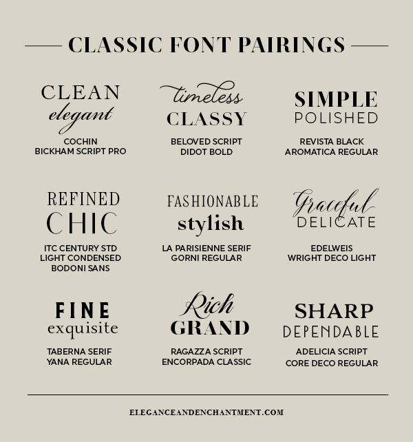
- Exploring Font Pairing Examples: To provide practical examples, let’s explore some popular font pairings:
- Montserrat (a clean and modern sans-serif) with Merriweather (a classic and elegant serif): This combination creates a contemporary yet sophisticated aesthetic suitable for various design projects.
- Roboto (a versatile and geometric sans-serif) with Lato (a humanist sans-serif): This pairing offers a balanced blend of professionalism and friendliness, making it suitable for corporate and informational designs.
- Playfair Display (a stylish and decorative serif) with Source Sans Pro (a simple and versatile sans-serif): This combination achieves an elegant and refined look, ideal for luxury branding or editorial layouts.
Pairing fonts is an art that requires a delicate balance between contrast and harmony. By understanding the personality of fonts, considering contrast and cohesion, prioritizing readability, and exploring well-curated examples, designers can create captivating typographic combinations. The careful selection and pairing of fonts enhance the visual appeal, convey the intended message, and elevate the overall design aesthetics. Whether it’s a website, branding project, or print collateral, the art of font pairing plays a significant role in effective communication and brand identity. By mastering this skill and exploring various combinations, designers can unlock a world of creative possibilities and create memorable and impactful designs.
