Posted on

The Impact of Color in Graphic Design: Enhancing Visual Communication

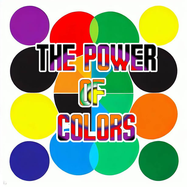
Color plays a fundamental role in graphic design, influencing how people perceive and interact with visual content. In this article, we will explore the significance of color in graphic design and how it enhances visual communication. Understanding the psychological and emotional impact of colors, as well as their symbolic associations, empowers designers to create compelling and effective designs. From color theory to color harmonies and the use of color in branding, we will delve into various aspects of color in graphic design to uncover its profound impact on the audience.

Pin on Reference

Continue reading The Impact of Color in Graphic Design: Enhancing Visual Communication

Posted on

Responsive Typography: Designing Readable and Adaptive Text for Different Devices

 In today’s digital age, where users access content across various devices, responsive typography plays a vital role in ensuring optimal readability and user experience. In this article, we explore the concept of responsive typography and its significance in designing adaptive text that seamlessly adjusts to different screen sizes and resolutions. We delve into the key principles and techniques behind responsive typography, highlighting its impact on content legibility, visual hierarchy, and overall user engagement.

Scott Kellum: Practical Responsive Typography – WordPress.tv
Continue reading Responsive Typography: Designing Readable and Adaptive Text for Different Devices

Posted on

Functionality and Beauty in Typography: Striking the Perfect Balance

Typography is a crucial element of design that goes beyond just conveying information—it plays a pivotal role in establishing the tone, enhancing readability, and creating a visual experience. Two key aspects that designers must consider when working with typography are functionality and beauty. In this article, we will explore the importance of striking the perfect balance between functionality and beauty in typography, and how it can elevate the overall design aesthetic.

Continue reading Functionality and Beauty in Typography: Striking the Perfect Balance

Posted on

Kerning and Tracking in Typography: Achieving Harmonious Use

Typography involves much more than selecting the right typeface; it also requires careful attention to the spacing between letters and words. Kerning and tracking are two essential techniques that allow designers to achieve harmonious and visually pleasing typography. In this article, we will explore the concepts of kerning and tracking, their purpose, and how they contribute to the overall aesthetics and readability of typographic compositions.

Continue reading Kerning and Tracking in Typography: Achieving Harmonious Use

Posted on

The Importance of Proportions in Typography: A Comprehensive Analysis

Typography is not just about selecting the right typeface or arranging letters on a page; it also involves paying careful attention to the proportions within a font. Proportions play a crucial role in determining the overall harmony, legibility, and aesthetic appeal of a typeface. In this article, we will explore the importance of proportions in typography, highlighting their impact on readability, visual balance, and the overall user experience.

Continue reading The Importance of Proportions in Typography: A Comprehensive Analysis