Typography is a central aspect of graphic design, serving not only as a vehicle for delivering written messages but also as a powerful visual tool that can influence how content is perceived and understood. In the realm of typography, three fundamental concepts—kerning, tracking, and leading—play crucial roles in determining the appearance, readability, and overall aesthetic of text. These three typographic adjustments help designers control the spacing between letters, words, and lines, thereby influencing the flow of a text and how it interacts with the reader’s eye.
Each of these concepts has its own specific function in typography. Kerning refers to the adjustment of space between individual pairs of letters, while tracking involves the uniform adjustment of space across entire words or blocks of text. Leading, on the other hand, governs the vertical space between lines of text. By manipulating these three elements, designers can ensure that their typography is both functional and aesthetically pleasing.
In this essay, we will explore in detail the importance of kerning, tracking, and leading in typography, examining how each of these typographic adjustments affects readability, visual harmony, and the overall effectiveness of a design. We will also discuss best practices for applying these techniques and how designers can balance functionality with aesthetics when working with type.
1. Kerning: Adjusting Space Between Letters
Kerning is the process of adjusting the space between two specific characters in a word or phrase to create a more visually pleasing and harmonious result. The primary goal of kerning is to balance the space between letters in such a way that they appear evenly spaced, preventing awkward gaps or crowding that can disrupt the overall flow and readability of the text.
The Importance of Kerning in Typography
Kerning is critical for achieving a professional and polished look in typography, particularly when working with display text such as headlines, logos, or branding elements where the size of the text makes spacing imperfections more noticeable. Without proper kerning, letters may appear unevenly spaced, which can detract from the overall visual balance of the text and make it harder to read.
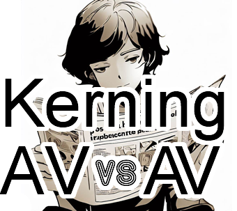
For example, certain letter pairs, such as “A” and “V” or “T” and “o,” naturally create awkward gaps due to the shapes of the letters. If left unadjusted, these gaps can draw attention to themselves, creating visual distractions that take away from the overall impact of the design. Kerning addresses these inconsistencies by fine-tuning the space between individual letter pairs, ensuring that the text appears smooth and visually coherent.
Kerning is particularly important in logo design and branding, where the aesthetic quality of the text plays a significant role in shaping how the brand is perceived. Even minor adjustments in kerning can make a logo appear more refined, balanced, and professional, contributing to the overall success of the brand’s visual identity.
Optical Kerning vs. Manual Kerning
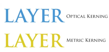
There are two main approaches to kerning: optical kerning and manual kerning.
- Optical kerning is typically performed automatically by design software. It adjusts the spacing between characters based on their shapes and visual weight. Optical kerning is generally sufficient for body text or longer paragraphs where individual letter spacing is less noticeable, as it applies a general algorithm to ensure consistency across the text.
- Manual kerning, on the other hand, involves adjusting the spacing between specific letter pairs by hand. This is often necessary for display text, logos, or headlines, where precision is key. Manual kerning allows designers to exercise greater control over the visual appearance of the text, making subtle adjustments that reflect their design intent.
Designers should be aware of when to rely on optical kerning and when manual adjustments are necessary. While optical kerning can save time and is generally accurate for smaller text, manual kerning is essential for achieving perfect spacing in larger, more prominent text.
Kerning Best Practices
- Focus on Display Text: Kerning is especially important in large, display text such as headlines, titles, and logos. These elements are more likely to be scrutinized by viewers, making spacing imperfections more noticeable.
- Pay Attention to Problematic Letter Pairs: Certain letter combinations, such as “AV,” “To,” “WA,” and “Yo,” often require more kerning adjustments than others. Designers should inspect these pairs carefully to ensure proper spacing.
- Check Kerning at Multiple Sizes: Text that looks well-kerned at a large size may appear awkward when scaled down, and vice versa. Designers should always check the kerning at various sizes to ensure consistency across different contexts.
- Consider the Typeface: Different typefaces require different kerning treatments. Some fonts come with built-in kerning tables that are optimized for most common letter pairs, but designers should always review and adjust as necessary to fit the specific design context.
2. Tracking: Adjusting Space Across Words or Text Blocks
Tracking (also known as letterspacing) refers to the uniform adjustment of space across entire words, sentences, or blocks of text. Unlike kerning, which deals with individual letter pairs, tracking applies a consistent amount of space between all the letters in a given section of text. This typographic tool allows designers to control the overall density and appearance of the text, making it looser or tighter as needed.
The Function of Tracking in Typography
Tracking is used to control the overall spacing of text to either compress or expand it for aesthetic, functional, or practical reasons. In situations where a block of text needs to fit within a specific layout or when more white space is needed for clarity, tracking can be adjusted to ensure that the text remains visually balanced and easy to read.
- Tight tracking (reducing the space between letters) can be used to create a more compact, dense appearance. This is often effective in headlines or titles, where a bold, tight composition is desired to convey a sense of urgency or strength.
- Loose tracking (increasing the space between letters) can create a more open, airy feel, which may be useful for improving legibility in longer blocks of text or adding elegance and sophistication to a design.
Tracking is also used for adjusting text to fit within specific layouts or design constraints. For example, designers may slightly reduce tracking to make a headline fit neatly within a predetermined space or increase tracking to spread out a block of text to balance the layout.
Tracking and Readability
While tracking can be used to enhance the aesthetic of text, it also directly affects readability. Tight tracking may make letters too close together, causing them to blur into one another and become difficult to read. Conversely, excessive loose tracking may disrupt the natural flow of reading by introducing too much white space between letters, forcing the reader’s eye to work harder to connect the characters.
When adjusting tracking, designers must find the right balance between aesthetics and readability. In body text, especially for long passages, tracking should generally remain neutral, ensuring that the text is comfortable to read without unnecessary tightness or openness. In contrast, display text allows for more creative freedom, where tracking can be manipulated to achieve specific visual effects while maintaining legibility.
Tracking Best Practices
- Maintain Neutral Tracking for Body Text: In long-form content such as paragraphs or blocks of text, tracking should remain neutral to ensure readability. Excessive tightness or looseness can strain the reader’s eye and reduce comprehension.
- Experiment with Display Text: Tracking adjustments can be more aggressive in larger, display text. Tight tracking may create a sense of urgency or compactness, while loose tracking can evoke elegance or spaciousness.
- Be Mindful of Typeface Design: Some typefaces are designed with tighter or looser spacing in mind. Designers should always consider how the default tracking of a typeface fits into their design context before making adjustments.
- Avoid Extreme Tracking: While tracking adjustments can enhance the visual impact of text, extreme changes in either direction (too tight or too loose) can compromise legibility and make the text difficult to read.
3. Leading: Adjusting Space Between Lines of Text
Leading refers to the vertical space between lines of text. It gets its name from the strips of lead that were once used to separate lines of text in traditional typesetting. Adjusting the leading in a block of text is essential for ensuring comfortable reading and visual harmony, as it controls how tightly or loosely lines of text are spaced from one another.
The Role of Leading in Typography
Leading plays a crucial role in determining the overall readability and appearance of multi-line text. Properly set leading ensures that lines of text are spaced far enough apart to prevent crowding while maintaining a cohesive visual flow. Without enough leading, the lines of text can feel cramped, making it difficult for the reader’s eye to move smoothly from one line to the next. Conversely, excessive leading can create too much separation between lines, disrupting the reader’s natural rhythm and reducing readability.
Leading also affects the overall texture and density of a block of text. For example, tight leading may create a more compact, uniform block of text, which can be useful in certain design contexts where space is limited. Loose leading, on the other hand, adds more white space between lines, making the text feel more open and approachable.
Leading and Readability
The primary function of leading is to enhance readability by providing sufficient space between lines of text. When leading is set too tight, the lines of text may overlap visually, causing the reader’s eye to lose track of where one line ends and the next begins. This can lead to a frustrating reading experience, particularly in longer passages of text.
Loose leading, while often more comfortable to read, can also hinder readability if overdone. Excessive space between lines can cause the reader to lose their place, disrupting the flow of reading and making the text feel disconnected. The ideal amount of leading depends on the typeface, the size of the text, and the context in which it is used.
In general, leading should be slightly larger than the font size itself to provide adequate space between lines. For instance, if a body text is set at 12 points, the leading might be set to 14 or 15 points to ensure sufficient separation between the lines. However, different typefaces may require different amounts of leading due to variations in x-height, ascender and descender lengths, and overall design.
Leading Best Practices
- Increase Leading for Smaller Text: Smaller text sizes often benefit from slightly increased leading to improve readability. The extra space between lines helps prevent visual crowding and ensures that the text remains easy to read.
- Adjust Leading Based on Typeface: Typefaces with large x-heights or long ascenders and descenders may require more leading to ensure that the lines of text do not collide or overlap. Conversely, typefaces with shorter ascenders and descenders may require less leading.
- Maintain Consistency Across Paragraphs: Consistent leading throughout a block of text is essential for creating a cohesive and readable layout. Varying the leading within the same paragraph or document can create a disjointed appearance and disrupt the reader’s flow.
- Consider the Reading Context: Leading should be adjusted based on the medium and context in which the text will be read. For example, printed materials may require slightly tighter leading than digital interfaces, where more space between lines improves readability on screens.
Conclusion
Kerning, tracking, and leading are foundational tools in the typographic toolkit, each playing a critical role in shaping the visual presentation and readability of text. By adjusting the space between individual letters (kerning), across entire words or blocks of text (tracking), and between lines of text (leading), designers can create compositions that are both aesthetically pleasing and highly functional.
Kerning ensures that individual letter pairs are evenly spaced, creating a harmonious and polished appearance. Tracking allows designers to control the overall density and spacing of text, striking a balance between tightness and openness. Leading governs the vertical spacing between lines, ensuring that multi-line text is easy to read and visually balanced.
When used effectively, these typographic adjustments can elevate the quality of a design, enhancing its legibility, flow, and overall visual impact. For designers, mastering the art of kerning, tracking, and leading is essential for creating typography that not only looks beautiful but also communicates clearly and effectively.
Continue reading Kerning, Tracking, and Leading in Typography: Essential Tools for Visual Harmony


