Posted on

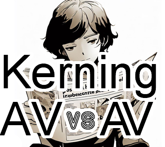
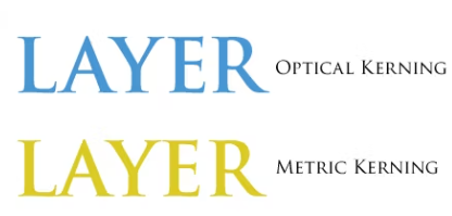
Understanding the Differences Between Optical Kerning and Metric Kerning

Kerning is an essential aspect of typography that involves adjusting the space between two characters to create a visually pleasing and consistent flow between letters. There are two types of kerning: optical kerning and metric kerning. In this article, we will explore the differences between these two types of kerning and how they can impact the look and feel of typography.
Continue reading Understanding the Differences Between Optical Kerning and Metric Kerning

Posted on

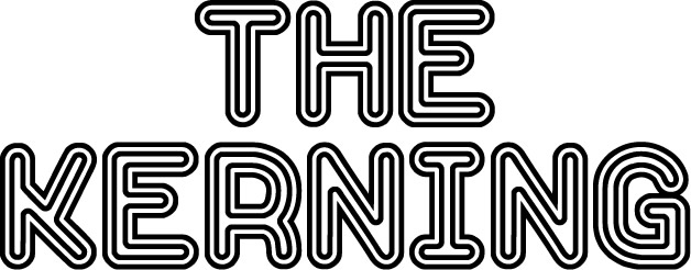
The Kerning

Typography is an essential aspect of graphic design, and it involves the use of fonts to convey a message. Kerning is one of the critical elements of typography that designers use to improve the visual appeal of text. Kerning refers to the adjustment of space between two characters to create a visually pleasing and consistent flow between letters. It is a seemingly small adjustment that has a significant impact on the look and feel of typography. In this article, we will explore the basics of kerning in fonts, its benefits, and how it can improve the readability and legibility of text.

Kerning & kerning pairs – Fonts Knowledge - Google Fonts
Continue reading The Kerning

Posted on

Using Fonts for Commercial Use: Guidelines and Best Practices

Fonts are valuable assets in commercial design projects, whether you’re creating logos, advertisements, packaging, or websites for businesses. However, using fonts for commercial purposes requires a clear understanding of licensing, permissions, and best practices to ensure compliance with copyright laws. In this article, we will explore the concept of commercial use of fonts and provide essential guidelines to follow when incorporating fonts into your commercial projects.

Continue reading Using Fonts for Commercial Use: Guidelines and Best Practices

Posted on

Exploring ‘La Que Cuelga’: A Striking Typeface by Southype

La que cuelga

Typography has the power to captivate and engage viewers through its unique and innovative designs. In the world of typefaces, Southype has gained recognition for its remarkable creations that showcase the cultural richness of South America. One such typeface that has caught the attention of designers and typographers is “La Que Cuelga.” In this article, we delve into the intriguing characteristics and creative inspiration behind this distinctive typeface by Southype.

La que cuelga Shop

Continue reading Exploring ‘La Que Cuelga’: A Striking Typeface by Southype

Posted on

Typography Design for Video Games: Enhancing the Gaming Experience

Typography plays a crucial role in the design of video games, as it not only communicates information but also enhances the overall gaming experience. The right choice of fonts and typographic elements can convey the game’s theme, set the mood, and provide clarity and readability to the players. This article delves into the fascinating world of typography design for video games, exploring the importance of typography, key considerations, and tips for creating visually appealing and immersive gaming experiences. Continue reading Typography Design for Video Games: Enhancing the Gaming Experience