
Kerning is an essential aspect of typography that involves adjusting the space between two characters to create a visually pleasing and consistent flow between letters. There are two types of kerning: optical kerning and metric kerning. In this article, we will explore the differences between these two types of kerning and how they can impact the look and feel of typography.
Optical Kerning
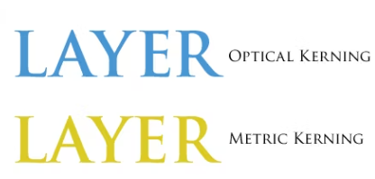
Optical kerning adjusts the spacing between adjacent characters based on their shapes and is optimized for use with Roman glyphs. Some fonts include robust kern-pair specifications. However, when a font includes only minimal built-in kerning or none at all, or if you use two different typefaces or sizes in the same line of text, optical kerning can be less effective.Optical kerning is more precise and can create a more visually appealing result. It adjusts the space between letters based on their shapes and sizes, rather than relying on pre-set kerning pairs. This means that the spacing between letters can be adjusted more precisely, resulting in a more visually appealing design.
Metric Kerning
Metrics kerning uses kern pairs, which are included with most fonts. Kern pairs contain information about the spacing of specific pairs of letters. Some of these are: LA, P., To, Tr, Ta, Tu, Te, Ty, Wa, WA, We, Wo, Ya, and Yo. InDesign uses metrics kerning by default so that specific pairs are automatically kerned when you import or type text.Metrics kerning is less precise than optical kerning because it relies on pre-set kerning pairs. This means that the spacing between letters may not be as visually appealing as it could be. However, metrics kerning is faster and easier to use than optical kerning, making it a popular choice for designers who need to work quickly.
Which One Should You Use?
The choice between optical kerning and metric kerning depends on the specific needs of your design. If you are working with a font that has robust kern-pair specifications, optical kerning may be the best choice. It can create a more visually appealing result and is more precise than metrics kerning.However, if you are working with a font that has minimal built-in kerning or none at all, metrics kerning may be the better choice. It is faster and easier to use than optical kerning and can still create a visually appealing result.It is also important to note that both optical kerning and metrics kerning should be used sparingly and only when necessary. Over-kerning can make the text look unnatural and difficult to read.
Advantages of Optical Kerning
Optical kerning adjusts the spacing between adjacent characters based on their shapes and is optimized for use with Roman glyphs. One of the advantages of optical kerning is that it is more precise than metric kerning. It adjusts the space between letters based on their shapes and sizes, rather than relying on pre-set kerning pairs. This means that the spacing between letters can be adjusted more precisely, resulting in a more visually appealing design.Another advantage of optical kerning is that it can create a more visually appealing result. It adjusts the space between letters based on their shapes and sizes, which can result in a more visually appealing design. This can be particularly useful when working with fonts that have minimal built-in kerning or none at all.
Disadvantages of Optical Kerning
One of the disadvantages of optical kerning is that it can be less efficient than metric kerning. It requires more resources to analyze the shapes and sizes of each letter, which can slow down the design process. Additionally, optical kerning may not be as effective when working with fonts that have robust kern-pair specifications.
Advantages of Metric Kerning
Metrics kerning uses kern pairs, which are included with most fonts. One of the advantages of metric kerning is that it is faster and easier to use than optical kerning. It relies on pre-set kerning pairs, which means that the spacing between letters can be adjusted quickly and efficiently.Another advantage of metric kerning is that it is more effective when working with fonts that have robust kern-pair specifications. It uses pre-set kerning pairs, which means that the spacing between letters can be adjusted quickly and efficiently.
Disadvantages of Metric Kerning
One of the disadvantages of metric kerning is that it is less precise than optical kerning. It relies on pre-set kerning pairs, which means that the spacing between letters may not be as visually appealing as it could be. Additionally, metric kerning may not be as effective when working with fonts that have minimal built-in kerning or none at all.
Conclusion
Kerning is an essential aspect of typography that can significantly impact the readability and legibility of text. There are two types of kerning: optical kerning and metric kerning. Optical kerning adjusts the spacing between adjacent characters based on their shapes, while metrics kerning uses pre-set kerning pairs. The choice between these two types of kerning depends on the specific needs of your design. Both optical kerning and metrics kerning should be used sparingly and only when necessary. By understanding the differences between these two types of kerning, designers can create more visually appealing and effective designs.