Posted on

Understanding the Differences Between Optical Kerning and Metric Kerning

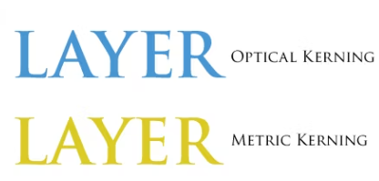
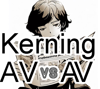
Kerning is an essential aspect of typography that involves adjusting the space between two characters to create a visually pleasing and consistent flow between letters. There are two types of kerning: optical kerning and metric kerning. In this article, we will explore the differences between these two types of kerning and how they can impact the look and feel of typography.

Continue reading Understanding the Differences Between Optical Kerning and Metric Kerning

Posted on

The Kerning

Typography is an essential aspect of graphic design, and it involves the use of fonts to convey a message. Kerning is one of the critical elements of typography that designers use to improve the visual appeal of text. Kerning refers to the adjustment of space between two characters to create a visually pleasing and consistent flow between letters. It is a seemingly small adjustment that has a significant impact on the look and feel of typography. In this article, we will explore the basics of kerning in fonts, its benefits, and how it can improve the readability and legibility of text.

Kerning & kerning pairs – Fonts Knowledge - Google Fonts
Continue reading The Kerning

Posted on

Kerning and Tracking in Typography: Achieving Harmonious Use

Typography involves much more than selecting the right typeface; it also requires careful attention to the spacing between letters and words. Kerning and tracking are two essential techniques that allow designers to achieve harmonious and visually pleasing typography. In this article, we will explore the concepts of kerning and tracking, their purpose, and how they contribute to the overall aesthetics and readability of typographic compositions.

Continue reading Kerning and Tracking in Typography: Achieving Harmonious Use