
In the world of graphic design, color plays a vital role in capturing attention, conveying emotions, and creating a specific mood. One of the key aspects of color that designers utilize is color temperature. Understanding color temperature and its application is essential for creating visually captivating and emotionally impactful designs. In this article, we will explore the concept of color temperature and delve into how designers can strategically use warm and cool colors to create compelling graphic compositions.
What is Color Temperature?
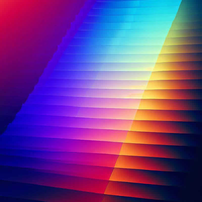
Color temperature refers to the perceived warmth or coolness of a color. It is measured in degrees Kelvin (K). Warm colors, such as reds, oranges, and yellows, have lower color temperatures and emit a sense of energy and vibrancy. On the other hand, cool colors, like blues, greens, and purples, have higher color temperatures and exude a calming and serene effect. This concept is rooted in the characteristics of light, as natural light sources like the sun emit colors with varying temperatures throughout the day.
The Application of Warm Colors in Graphic Design
Eliciting Emotion
Warm colors are known for their ability to evoke strong emotions. They can add a sense of excitement, passion, and urgency to a design. Many brands seeking to create a dynamic and energetic image often employ warm colors in their logos, marketing materials, and advertisements. By using warm colors strategically, designers can elicit specific emotional responses from their audience.
Attention-Grabbing
Warm colors naturally have a tendency to stand out in a visual composition. When used sparingly or as accents, they draw attention to specific elements, making them ideal for calls to action or important messages. By incorporating warm colors strategically in the design, designers can guide the viewer’s focus and direct their attention to the desired areas.
Creating Contrast
Combining warm colors with cooler hues can create visually striking contrasts. The juxtaposition of warm and cool colors adds visual interest and can highlight specific elements within a design. By carefully selecting contrasting color combinations, designers can create a sense of depth and dimension in their compositions.
The Application of Cool Colors in Graphic Design
Calm and Serenity
Cool colors have a calming effect, making them suitable for designs that aim to create a sense of tranquility or relaxation. Spa brands, healthcare institutions, and wellness-focused businesses often use cool colors to establish a soothing ambiance. By incorporating cool colors, designers can create a sense of calmness and serenity in their designs, which can be particularly effective in promoting a sense of well-being.
Professionalism and Sophistication
Cool colors can convey a sense of professionalism and sophistication. Businesses in finance, technology, and corporate sectors often use cool colors to instill trust and credibility. The cool color palette can create a sense of stability and reliability, making it an excellent choice for companies that want to project a professional image.
Depth and Space
Cool colors can also create an illusion of depth and space, making them ideal for backgrounds or large areas of a design. They can give the impression of expansiveness and openness. By using cool colors in the background, designers can create a sense of depth, allowing the foreground elements to stand out and grab the viewer’s attention.
Combining Warm and Cool Colors
The strategic combination of warm and cool colors can add depth and balance to a design. By understanding color harmonies, such as complementary or analogous color schemes, designers can achieve a harmonious visual composition that effectively communicates the intended message. When warm and cool colors are used together in a thoughtful and deliberate manner, they can create a dynamic and visually appealing design that engages the viewer.
Conclusion
Color temperature is a powerful tool in the arsenal of graphic designers. By skillfully incorporating warm and cool colors into their compositions, designers can evoke emotions, create focal points, and establish the desired mood for their projects. Whether aiming to inspire excitement, foster serenity, or convey professionalism, understanding the nuances of color temperature empowers designers to craft visually captivating and emotionally resonant graphic designs that leave a lasting impression on their audiences.
Remember, the key to successful graphic design lies in the thoughtful use of color temperature to effectively communicate a message and evoke a desired response. By harnessing the power of warm and cool colors, designers can create visually stunning compositions that captivate and engage viewers. So, experiment with color temperature and let your creativity shine through in your graphic design projects.