
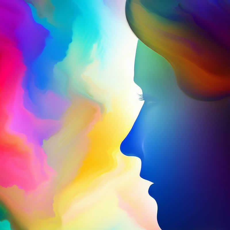
Colors play a significant role in shaping our emotions and behaviors. The study of color psychology aims to unravel how different hues evoke specific feelings and influence our perceptions. From the calming effect of blue to the energizing power of red, each color has the ability to communicate and connect with our innermost emotions. In this article, we delve into the captivating world of color psychology, shedding light on how colors shape our experiences and impact our daily lives.
The Influence of Color:
Colors go beyond being visual stimuli; they evoke powerful emotional responses that can influence our moods, decisions, and actions. As we interact with our surroundings, colors play a crucial role in shaping our perceptions of objects, spaces, and brands. The impact of color is evident in various fields, including design, marketing, and branding.
Warm vs. Cool Colors:
Colors are often categorized into warm and cool tones. Warm colors such as red, orange, and yellow are associated with energy, excitement, and passion. These hues can create a sense of urgency and stimulate appetite, making them suitable for calls to action or attention-grabbing elements. On the other hand, cool colors like blue, green, and purple evoke feelings of calmness, tranquility, and serenity. These shades are commonly used in branding to convey professionalism, reliability, and stability.
The Psychology of Specific Colors:
1. Red:
The color red symbolizes energy, power, and urgency. It can evoke strong emotions, stimulate appetite, and create a sense of urgency. Red is often used for calls to action or attention-grabbing elements in marketing materials.
2. Blue:
Blue is associated with calmness, trust, and reliability. It is often used in corporate branding to convey a sense of professionalism and stability. Blue is known to have a soothing effect on the mind and can promote feelings of relaxation and tranquility.
3. Green:
Green symbolizes harmony, balance, and renewal. As the color of nature and growth, it is often used in eco-friendly and wellness-related contexts. Green can have a calming effect and is associated with feelings of freshness and vitality.
4. Yellow:
Yellow radiates warmth and happiness. It is associated with joy, optimism, and creativity. Yellow can be used to create a sense of enthusiasm or to highlight important information. It is a vibrant and attention-grabbing color that can evoke feelings of cheerfulness and positivity.
5. Purple:
Purple combines the energy of red and the serenity of blue. It exudes luxury, creativity, and spirituality. Purple is often used in branding to convey elegance and sophistication. This color can have a calming effect and is associated with feelings of mystery and intrigue.
6. Orange:
Orange embodies enthusiasm, friendliness, and warmth. As a blend of red and yellow, it can create a sense of excitement and encourage impulsive actions. Orange is often used to grab attention and evoke feelings of energy and enthusiasm.
Cultural and Contextual Influences:
Color perceptions can vary across cultures and contexts. What may be considered a positive color in one culture may carry a different meaning in another. For example, while white is associated with purity and weddings in Western cultures, it symbolizes mourning in some Asian cultures. Designers and marketers must consider these cultural nuances to create visually appealing and culturally sensitive visuals.
Color Combinations and Harmonies:
Understanding color harmonies empowers designers to create visually pleasing and balanced compositions. Different color combinations can evoke different emotions and enhance the overall impact of the design. Some popular color harmonies include complementary, analogous, and triadic color schemes.
Complementary colors are those that are opposite each other on the color wheel, such as red and green or blue and orange. These combinations create a high contrast, making elements stand out.
Analogous colors are those that are next to each other on the color wheel, such as blue, green, and teal. These combinations create a harmonious and cohesive look.
Triadic color schemes involve selecting three colors that are evenly spaced on the color wheel, such as red, yellow, and blue. These combinations create a vibrant and energetic look.
Conclusion:
The field of color psychology unveils the intricate relationship between colors and human emotions. From the warm allure of red to the calming embrace of blue, colors have the power to shape our perceptions, influence our decisions, and enrich our experiences. By harnessing the emotional potential of colors, designers and marketers can create impactful visuals that resonate deeply with their audiences. As we continue to explore the realm of color psychology, we unveil a spectrum of possibilities, allowing colors to become not just elements of design, but powerful conduits of expression, connection, and understanding.
Additional Information:
- It is important to consider color accessibility and inclusivity when using color in design. Ensure that color choices take into account individuals with color blindness or other visual impairments.
- Colors can have different meanings and associations in different industries. For example, red is often associated with passion and love in the context of Valentine’s Day, while green is commonly associated with environmental sustainability.
- The impact of color on emotions can vary from person to person. While certain colors may generally evoke specific emotions, individual experiences and cultural backgrounds can influence how colors are perceived and interpreted.