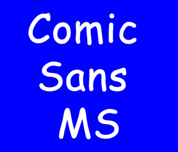
The Creation of Comic Sans
Comic Sans is a font that has managed to elicit strong reactions from both supporters and critics alike. The font was created in 1994 by Vincent Connare, a typographer at Microsoft who was tasked with designing a new font for a software package aimed at children. Connare’s vision was to create a font that would mimic the handwriting found in comic books, and he succeeded in doing so successfully. Although initially created for a specific purpose, Comic Sans quickly caught on and soon became one of the world’s most commonly used fonts, found in everything from school assignments to official government documents. However, despite its widespread use, the font has been criticized by many in the design community due to its informal and childish appearance, which some believe detracts from the seriousness of the message it is meant to convey. Despite the criticisms, the creation of Comic Sans has had a significant impact on the world of typography and design. Its success has led to the creation of other fonts that use similar handwriting-inspired designs, and it has become a symbol of the ongoing debate around the role of fonts in conveying information. Whether people love it or hate it, there’s no denying that Comic Sans has left a lasting impression on the world of design and typography.
The Rise of Comic Sans
Comic Sans is a font that was created by Microsoft designer Vincent Connare in 1994. Initially intended for use in a program called Microsoft Bob, which was designed to make computers more accessible to young children, the font quickly became popular for a variety of uses. The distinctive, playful design of Comic Sans has made it a favorite among many people for use in documents, posters, and other creative projects. It has become particularly popular in the world of graphic design and branding, where it is often used to convey a sense of fun and playfulness. However, Comic Sans has also been the subject of controversy and criticism. Many designers and typographers feel that the font is overused, poorly designed, and not appropriate for professional or serious contexts. Some have even called for a boycott of the font and its removal from various software programs. Despite the criticism, Comic Sans remains a popular and widely recognized font. Its unique style and easy readability make it a versatile choice for a wide range of applications. Its rise in popularity may also reflect a broader cultural shift towards a more informal and playful tone in many areas of life.
Controversies Surrounding Comic Sans
Comic Sans is a font that has become infamous for the controversies that surround it. While many people find it to be a fun and playful font, others view it as unprofessional and inappropriate for certain contexts. This font was originally designed for use in Microsoft products such as Publisher and PowerPoint, but it quickly gained popularity as a choice for informal documents and websites. One of the main criticisms of Comic Sans is that it lacks the professionalism required for many contexts. For example, it may be seen as inappropriate for use in academic papers, formal business documents, or official government websites. Many people argue that its playful nature and informal design do not reflect the seriousness of these types of situations. Additionally, some people find the font difficult to read or visually unappealing. On the other hand, defenders of Comic Sans argue that it is a useful font in certain situations. They claim that it is easy to read, especially for people with dyslexia and other reading disabilities. Additionally, they argue that its playful design can be appropriate in certain creative contexts, such as advertising or children’s books. Despite the controversies surrounding Comic Sans, it remains a popular font choice for many people. While it may not be appropriate for all situations, there are certainly contexts where its playful nature can be an asset. Ultimately, the success of Comic Sans will depend on its appropriate use and its ability to effectively convey the intended message.
Comic Sans Today and Its Impact
Comic Sans is a font that was designed by Vincent Connare in 1994 as a casual typeface for use in children’s materials and other informal settings. The font was intended to mimic the look of comic book lettering while providing a light and playful tone. However, over the years, Comic Sans has become a controversial symbol of bad design and has been widely ridiculed by many in the design community. Despite its negative reputation, Comic Sans remains a popular font used by individuals and organizations worldwide. Its informal and playful design is still seen as appropriate for certain contexts, including event invitations and children’s materials. The font has even spawned its own meme culture, with many internet users using Comic Sans ironically or in jest. Despite its continued use, Comic Sans has had a significant impact on the design industry. Its widespread popularity has highlighted the importance of typography in effective communication, and has drawn attention to the need for designers to consider the appropriateness of a font for a given context. In many ways, Comic Sans has become a cautionary tale for designers, reminding them of the power of font choice and the importance of selecting a typeface that fits the intended message and audience. In conclusion, while Comic Sans may be a font that is widely ridiculed, its continued use and impact illustrate the enduring influence of typography in communication and design. By reminding designers of the importance of context and appropriateness, Comic Sans has left a lasting legacy in the design community.

