Posted on

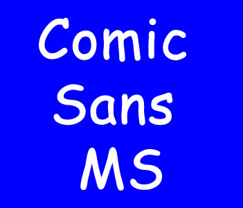
Comic Sans – The History

The Creation of Comic Sans

Comic Sans is a font that has managed to elicit strong reactions from both supporters and critics alike. The font was created in 1994 by Vincent Connare, a typographer at Microsoft who was tasked with designing a new font for a software package aimed at children. Connare’s vision was to create a font that would mimic the handwriting found in comic books, and he succeeded in doing so successfully. Although initially created for a specific purpose, Comic Sans quickly caught on and soon became one of the world’s most commonly used fonts, found in everything from school assignments to official government documents. However, despite its widespread use, the font has been criticized by many in the design community due to its informal and childish appearance, which some believe detracts from the seriousness of the message it is meant to convey. Despite the criticisms, the creation of Comic Sans has had a significant impact on the world of typography and design. Its success has led to the creation of other fonts that use similar handwriting-inspired designs, and it has become a symbol of the ongoing debate around the role of fonts in conveying information. Whether people love it or hate it, there’s no denying that Comic Sans has left a lasting impression on the world of design and typography. Continue reading Comic Sans – The History

Posted on

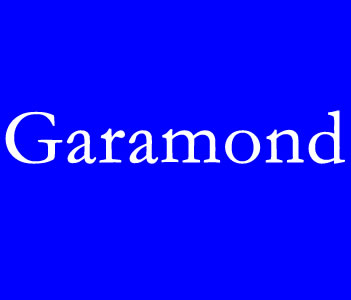
Garamond, The History

The Life of Claude Garamond

Claude Garamond was a French type designer who lived between the late 15th century and the mid-16th century. He is considered one of the most notable figures in the history of typography, having created several typefaces that are still used today. Little is known about Garamond’s early life, but it is believed that he was born in Paris in the early 1480s. He started his career as a punch cutter, creating metal punches for creating individual metal letters for printing. Later, he started designing complete typefaces, making improvements to existing designs and creating new ones. Garamond is best known for his eponymous typeface, which has become one of the most widely used and recognized typefaces in the world. The Garamond typeface is characterized by its elegant, delicate strokes, and its expert balance between the thick and thin lines. Garamond’s legacy is not just in the typefaces he created, but also in the techniques he pioneered in typography. He believed that typefaces should be designed to look like handwriting, rather than artificial shapes, and strove to achieve this in his work. He also revolutionized the way typefaces were created, introducing the concept of standardized sizes and weights for letters. Despite his immense contributions to typography, Garamond died in relative obscurity, without much recognition for his work. However, his legacy has lived on, with his typefaces still widely used today and his influence in the world of typography still felt.

undefined
Continue reading Garamond, The History

Posted on

Southype: A Journey into the World of South American Typography

The House of Fonts

Typography is a universal language that transcends borders, cultures, and continents. In South America, a vibrant and diverse typography scene has emerged, reflecting the rich cultural heritage and creative spirit of the region. One prominent player in this scene is Southype, a renowned type foundry dedicated to showcasing the unique typographic voices of South America. In this article, we will explore the fascinating world of Southype, its vision, contributions to the industry, and some of its notable typefaces.

Continue reading Southype: A Journey into the World of South American Typography