Posted on

The History and Significance of the @ Symbol

The @ symbol, a ubiquitous symbol in our digital era, carries a captivating history that stretches back centuries. Originating as a shorthand for the word “at,” it has evolved from its humble beginnings to become an essential component of email addresses, social media handles, and website URLs. The symbol’s journey encompasses intriguing facts, cultural variations in nomenclature, and even its artistic applications. This essay delves into the captivating history and significance of the @ symbol, exploring its transformative role in connecting people, facilitating communication, and fostering creative expression.


The @ symbol has a rich and fascinating history that stretches back centuries. Originating in the 16th century, it emerged as a shorthand for the word “at.” Initially, it was written as a lowercase “a” with a superscript “t,” but over time, it underwent transformations to become the familiar @ symbol we know today. Continue reading The History and Significance of the @ Symbol

Posted on

Free Typeface Resource

 Exploring the World of Free Fonts

Typography is a fundamental element of design, and the choice of typeface greatly influences the visual impact and overall effectiveness of any project. While premium fonts offer a wide range of high-quality options, free typefaces have become increasingly popular among designers, providing accessibility and affordability. This essay delves into the world of free typefaces, discussing their advantages, considerations when choosing them, and highlighting some notable resources for finding and utilizing these fonts. Continue reading Free Typeface Resource

Posted on

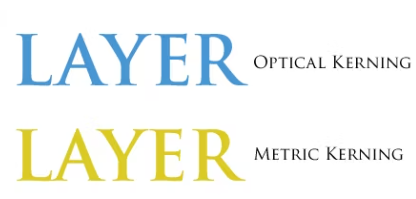
Understanding the Differences Between Optical Kerning and Metric Kerning

Kerning is an essential aspect of typography that involves adjusting the space between two characters to create a visually pleasing and consistent flow between letters. There are two types of kerning: optical kerning and metric kerning. In this article, we will explore the differences between these two types of kerning and how they can impact the look and feel of typography.

Continue reading Understanding the Differences Between Optical Kerning and Metric Kerning

Posted on

Typography Design for Video Games: Enhancing the Gaming Experience

Typography plays a crucial role in the design of video games, as it not only communicates information but also enhances the overall gaming experience. The right choice of fonts and typographic elements can convey the game’s theme, set the mood, and provide clarity and readability to the players. This article delves into the fascinating world of typography design for video games, exploring the importance of typography, key considerations, and tips for creating visually appealing and immersive gaming experiences. Continue reading Typography Design for Video Games: Enhancing the Gaming Experience