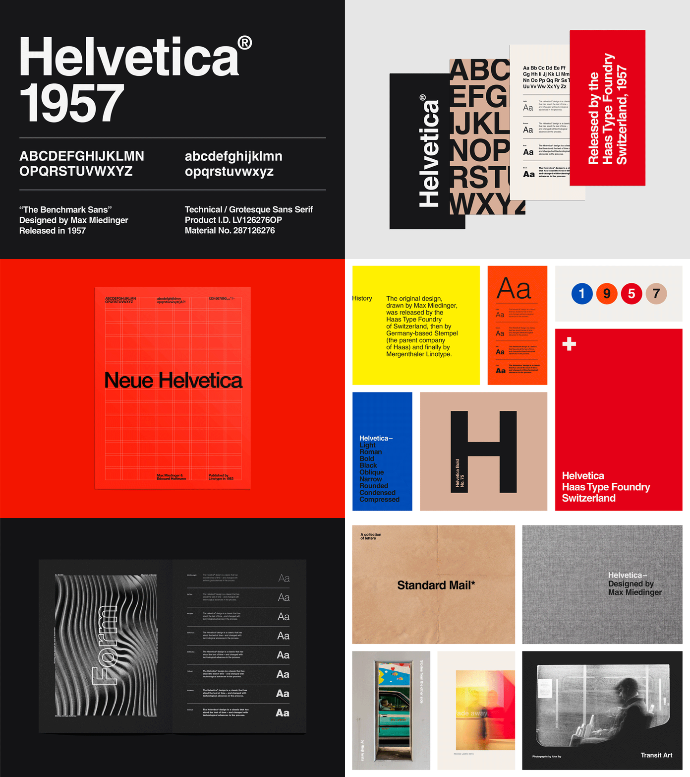
Helvetica, the iconic sans-serif typeface, stands as one of the most recognized and widely used fonts in the world. Its clean, neutral design has made it a favorite for decades, embraced by corporations, governments, and designers alike. To fully appreciate Helvetica’s significance, it’s essential to explore its origins, its design, and why it has maintained its relevance for so long. In this article, we will dive into the rich history of Helvetica, analyze its design principles, and reflect on its timeless appeal.
Continue reading Helvetica, Unveiling the Secret Behind the Typeface That Took Over the Design World
The History of Helvetica Typeface: Advantages and Disadvantages
Helvetica is one of the most iconic and influential typefaces in the history of graphic design. Developed in the late 1950s by Swiss typeface designer Max Miedinger and design entrepreneur Eduard Hoffmann, Helvetica has become synonymous with modernist design and is widely recognized for its clean, minimalist aesthetic. In this article, we will explore the fascinating history of Helvetica and examine its advantages and disadvantages as a typeface.

