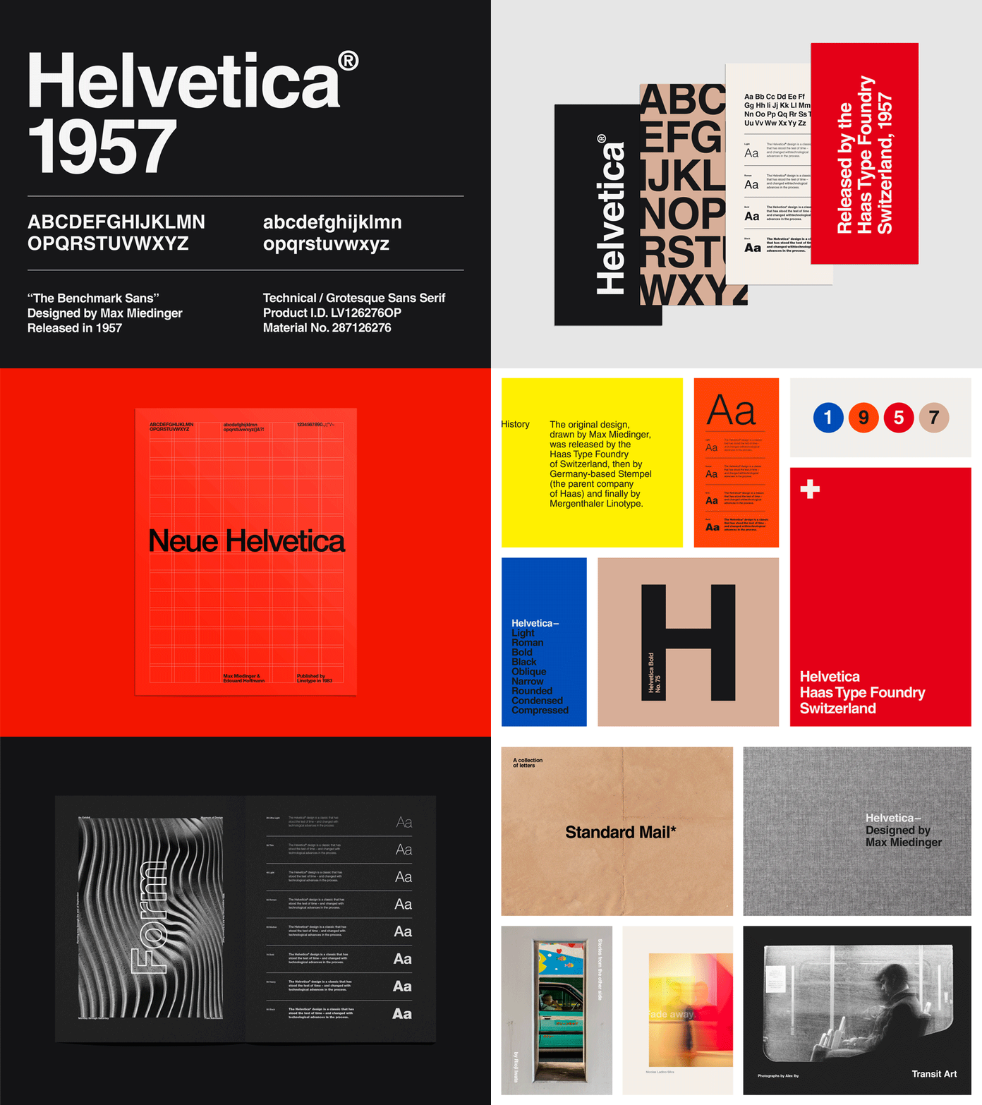
Helvetica is one of the most iconic and influential typefaces in the history of graphic design. Developed in the late 1950s by Swiss typeface designer Max Miedinger and design entrepreneur Eduard Hoffmann, Helvetica has become synonymous with modernist design and is widely recognized for its clean, minimalist aesthetic. In this article, we will explore the fascinating history of Helvetica and examine its advantages and disadvantages as a typeface.

- The Origins of Helvetica:
Helvetica was born out of the desire for a versatile, modern typeface that could be used across a wide range of applications. It was designed as a response to the need for a neutral and legible typeface that could adapt to various design contexts. The creators drew inspiration from earlier sans-serif typefaces, such as Akzidenz-Grotesk, to develop a new design that was both functional and visually appealing.
- The Rise of Helvetica:
After its release in 1957, Helvetica quickly gained popularity and became a hallmark of the International Typographic Style, also known as the Swiss Style. Its clean lines, uniform stroke width, and neutral appearance made it ideal for corporate branding, signage, and other graphic design applications. Helvetica’s simplicity and versatility allowed it to transcend cultural and language barriers, making it a global typeface choice.
- Advantages of Helvetica:
3.1. Legibility: One of the primary advantages of Helvetica is its exceptional legibility. The even spacing, open counters, and clear letterforms contribute to its readability at various sizes and in different media.
3.2. Versatility: Helvetica’s adaptable nature makes it suitable for a wide range of applications, including print, web, and digital interfaces. It can be used effectively in both body text and display settings.
3.3. Timelessness: Helvetica’s enduring popularity can be attributed to its timeless design. It has stood the test of time and remains a popular choice for designers looking for a contemporary yet classic typeface.
3.4. Brand Recognition: Many well-known brands, such as American Airlines, BMW, and Microsoft, have adopted Helvetica in their logos and visual identities. This association with reputable brands has further solidified its recognition and credibility.
3.5. International Appeal: Helvetica’s simplicity and neutrality allow it to be easily adapted to different languages and cultures. Its widespread use worldwide makes it a reliable choice for global communication.
- Disadvantages of Helvetica:
4.1. Lack of Distinctive Character: While Helvetica’s neutrality is one of its strengths, it can also be seen as a limitation. Some designers argue that its ubiquitous presence and lack of unique features can result in a lack of individuality or personality in design.
4.2. Overuse and Cliché: Helvetica’s popularity has led to its overuse in certain contexts, which can make it feel unoriginal or cliché. It is important for designers to carefully consider its usage to avoid contributing to visual monotony.
4.3. Limited Expressiveness: Helvetica’s simplicity and neutrality can limit its ability to evoke specific emotions or convey a particular visual tone. In contexts where a typeface with more character or expressiveness is desired, Helvetica may not be the most suitable choice.
4.4. Legibility at Small Sizes: Although Helvetica is generally highly legible, some argue that at small sizes or low resolutions, its uniform stroke width and lack of distinguishing features can make it slightly less readable compared to other typefaces specifically designed for small sizes.
Conclusion:
Helvetica’s impact on the world of typography and graphic design cannot be overstated. Its clean lines, neutrality, and versatility have made it a timeless choice for designers across different industries and applications. While it possesses many advantages, such as exceptional legibility, versatility, and international appeal, Helvetica is not without its limitations. Its neutrality can sometimes result in a lack of distinction, and its widespread use has made it feel overused and cliché in certain contexts.
Ultimately, the suitability of Helvetica as a typeface depends on the specific design goals, target audience, and context of the project. When used thoughtfully and paired with other typefaces or design elements, Helvetica can still deliver impactful and visually appealing results. Its enduring popularity and iconic status in the design world serve as a testament to its lasting influence.
