

Typography is an essential element in design, playing a vital role in conveying messages, evoking emotions, and establishing visual identities. Within the vast universe of typefaces, certain fonts have achieved widespread popularity and recognition, becoming go-to choices for designers across various industries. In this article, we will explore the top 10 most used typefaces in the world, examining their characteristics, applications, and the reasons behind their enduring appeal.
- Helvetica:

Helvetica is arguably one of the most ubiquitous typefaces, renowned for its clean, timeless aesthetic. Designed by Max Miedinger and Eduard Hoffmann in 1957, Helvetica’s simplicity, neutrality, and legibility have made it a favorite for both print and digital applications. It is commonly used in corporate branding, signage, advertising, and editorial design.
- Arial:

Arial, introduced by Monotype in 1982, bears a striking resemblance to Helvetica. It gained popularity due to its widespread inclusion in Microsoft software and operating systems. Arial is known for its versatility, clarity, and ease of reading, making it a popular choice for presentations, websites, and other digital media.
- Times New Roman:

Times New Roman, designed by Stanley Morison and Victor Lardent in 1932, is a classic serif typeface known for its elegance and legibility. It has been widely used in print media, including newspapers, magazines, and academic publications. Times New Roman is often associated with formal and traditional contexts.
- Calibri:
Calibri, designed by Lucas de Groot in 2004, gained prominence as the default font in Microsoft Office software. Its clean lines, rounded letterforms, and excellent readability on screens have contributed to its popularity. Calibri is commonly used in business documents, presentations, and digital communication.
- Futura:
Futura, designed by Paul Renner in the 1920s, is a geometric sans-serif typeface known for its modern, minimalist appearance. Its geometric proportions and distinctive letterforms have influenced many contemporary typefaces. Futura is frequently employed in branding, advertising, and editorial design to convey a sense of modernity and sophistication.
- Gill Sans:
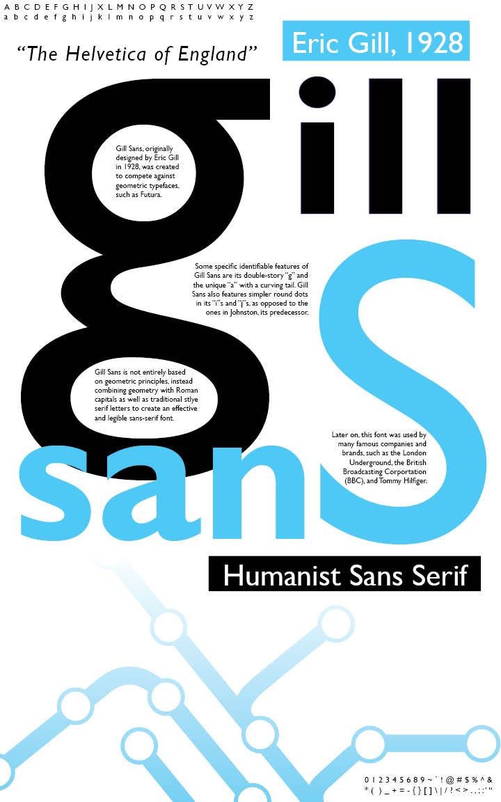
Gill Sans, created by Eric Gill in the 1920s, is a versatile sans-serif typeface with a humanist touch. Its balanced proportions, open letterforms, and legibility in both print and digital media have made it a popular choice for corporate branding, signage, and wayfinding systems.
- Arial Narrow:
Arial Narrow is a condensed version of the Arial typeface, offering a space-saving alternative without sacrificing readability. It is often used in situations where limited space is available, such as in narrow columns, captions, and subheadings.
- Garamond:
Garamond, named after the renowned French engraver Claude Garamond, is a timeless serif typeface known for its elegance and readability. Garamond typefaces exhibit delicate, classic letterforms and are frequently used in high-quality book design, print media, and formal invitations.
- Verdana:
Verdana, designed by Matthew Carter for Microsoft in 1996, is a humanist sans-serif typeface specifically optimized for screen readability. Its generous spacing, large x-height, and clear letterforms make it a popular choice for web design, user interfaces, and digital content.
- Baskerville:
Baskerville, created by John Baskerville in the 18th century, is a classic serif typeface characterized by its high contrast between thick and thin strokes. Its refined, elegant appearance has made it a popular choice for book typography, formal invitations, and luxury branding.
The world of typography is vast and diverse, offering a plethora of choices for designers to communicate their messages effectively. Within this vast landscape, certain typefaces have emerged as the most popular and widely used across various industries and applications. Helvetica, Arial, Times New Roman, Calibri, Futura, Gill Sans, Arial Narrow, Garamond, Verdana, and Baskerville have all earned their place as go-to typefaces due to their distinct characteristics, versatility, and widespread recognition.
These typefaces have stood the test of time and continue to be relied upon for their legibility, readability, and visual appeal. From the timeless simplicity of Helvetica to the classic elegance of Baskerville, each typeface has found its niche in different design contexts. Whether it’s corporate branding, print media, digital communication, web design, or book typography, these typefaces offer designers a reliable foundation to convey messages with clarity and style.
The enduring popularity of these typefaces can be attributed to their ability to adapt to changing design trends and technologies. From the traditional appeal of Times New Roman to the screen-optimized readability of Verdana, these typefaces have evolved and remained relevant in a digital age where visual communication plays a vital role.
While these typefaces dominate the design landscape, it’s important to remember that typography is a tool for creative expression and should be chosen thoughtfully based on the specific design context and objectives. Exploring lesser-known typefaces and experimenting with custom typography can lead to innovative and unique design solutions.
In conclusion, the top 10 most used typefaces in the world have become iconic in their own right, influencing design trends and shaping visual communication across diverse industries. Their enduring appeal lies in their ability to balance functionality and aesthetics, offering designers a reliable foundation to create visually captivating and effective designs. As typography continues to evolve, new typefaces will emerge, but these timeless favorites will always hold a special place in the world of design.