Posted on

Kerning and Tracking in Typography: Achieving Harmonious Use

Typography involves much more than selecting the right typeface; it also requires careful attention to the spacing between letters and words. Kerning and tracking are two essential techniques that allow designers to achieve harmonious and visually pleasing typography. In this article, we will explore the concepts of kerning and tracking, their purpose, and how they contribute to the overall aesthetics and readability of typographic compositions.

Continue reading Kerning and Tracking in Typography: Achieving Harmonious Use

Posted on

Gotics Fonts

Gothic fonts, also known as blackletter or Old English fonts, have a rich and fascinating history that spans several centuries. Evoking a sense of medieval charm and mystique, these typefaces have retained their allure and continue to be used in various design projects today. In this article, we will explore the unique characteristics of Gothic fonts, their advantages, disadvantages, and provide a curated list of contemporary Gothic fonts that maintain the essence of this captivating style.

Gothic Fonts: A Timeless Elegance

Continue reading Gotics Fonts

Posted on

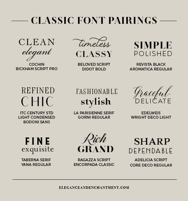
The Art of Pairing Fonts: Creating Harmonious Typographic Combinations

Typography is an art form that goes beyond selecting a single font. Pairing fonts is a skill that can greatly enhance the visual appeal and effectiveness of any design project, whether it’s a website, poster, or brochure. In this article, we will explore the art of pairing fonts, discussing the principles, techniques, and considerations that designers should keep in mind to create harmonious typographic combinations. From contrasting styles to complementary personalities, we will delve into the world of font pairing and discover how it can elevate the overall aesthetic and communication of a design.

Continue reading The Art of Pairing Fonts: Creating Harmonious Typographic Combinations

Posted on

Serif vs. Sans Serif: Exploring the Differences in Typeface Styles

Typography plays a crucial role in visual communication, and one of the fundamental distinctions in typeface design lies in the choice between serif and sans serif fonts. These two broad categories have distinct characteristics that can significantly impact the overall look and feel of a design. In this article, we will delve into the differences between serif and sans serif typefaces, exploring their unique features, historical contexts, and common applications.

Posted on

The Story of Times New Roman: A Classic Typeface

Times New Roman is a timeless and widely recognized typeface that has become a staple in the world of typography. Its origins can be traced back to the early 20th century when British newspaper tycoon, Lord Northcliffe, commissioned a new typeface for his newspaper, The Times. In this article, we will delve into the fascinating history of Times New Roman, its design influences, and its enduring popularity.