
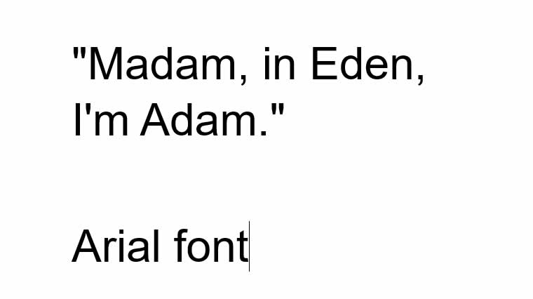
Arial is a widely recognized and often polarizing typeface that has been used extensively in various design applications. With its clean and modern appearance, Arial has become one of the most ubiquitous typefaces in the digital age. In this article, we will explore the history of Arial, its origins, and the controversy surrounding its creation.
Arial’s Origins: Monotype and the Grotesque Typeface
The roots of Arial can be traced back to the 1920s when the Monotype Corporation, a renowned British type foundry, introduced the Monotype Grotesque typeface. Grotesque typefaces were characterized by their simple, geometric forms and lack of serifs, making them highly legible and suitable for both text and display purposes. The Monotype Grotesque family became popular for its versatility and functional design.
The Arrival of Helvetica: The Inspiration for Arial
In the mid-1950s, the Swiss type foundry Haas introduced Helvetica, a typeface that would later become one of the most influential and widely used in the design world. Helvetica’s clean, neutral aesthetic and exceptional legibility made it a favorite among designers, especially in the corporate and advertising sectors. Its popularity grew rapidly, and it became a symbol of modernist typography.
The Birth of Arial: Controversy and Microsoft’s Involvement
In the early 1980s, digital typography began to gain traction, and the demand for scalable fonts increased. Recognizing the need for a Helvetica-like typeface for digital applications, Monotype Corporation, in collaboration with IBM, developed Arial as a part of their “Sonata” font family.
Arial was designed to be metrically compatible with Helvetica, meaning it had similar proportions and character widths. This compatibility was intentional, as it allowed documents created with Helvetica to be easily substituted with Arial on IBM printers without changing the layout or formatting.
Arial’s Controversy: The Helvetica Clone Debate
Arial quickly gained popularity due to its widespread inclusion in Microsoft Windows, starting with Windows 3.1 in 1992. However, Arial’s similarities to Helvetica sparked controversy and criticism from the design community. Many typographers accused Arial of being a poor imitation or a “clone” of Helvetica, claiming it lacked the refined details and elegance of the original typeface.
Despite the controversy, Arial’s adoption continued to grow, thanks to its inclusion in Microsoft Office applications and its widespread availability on both Windows and Macintosh platforms. Its familiarity and compatibility made it a practical choice for many designers and businesses, further cementing its position as one of the most widely used typefaces in the digital era.
Arial Today: A Typeface of Mixed Opinions
Today, Arial remains a popular choice for various design applications, especially in digital and corporate contexts. Its legibility, versatility, and availability make it a convenient option for many designers, while others continue to criticize its perceived lack of originality and aesthetic nuance compared to Helvetica.
In recent years, alternatives to Arial, such as Roboto and Open Sans, have gained popularity as designers seek typefaces with a similar modern aesthetic but with more originality. However, Arial’s ubiquity and compatibility ensure that it will remain a recognizable and frequently used typeface for years to come.
In conclusion, Arial’s history is marked by controversy and debate surrounding its similarities to Helvetica. Despite this, Arial has found its place as a widely used and recognizable typeface in the digital age. Whether loved or criticized, Arial’s impact on typography and design cannot be denied, and its influence will continue to shape the visual landscape for years to come.