Typography plays a vital role in design, branding, and communication. Certain typefaces have achieved widespread popularity and are commonly used across a range of applications. In this article, we will explore the ten most used typefaces in the world, examining their characteristics, popularity, and versatility.

- Helvetica
Helvetica is a timeless and versatile sans-serif typeface that has gained immense popularity since its creation in 1957. Its clean and neutral design makes it suitable for a wide range of applications, from corporate branding to signage and web design. Helvetica’s popularity can be attributed to its legibility and versatility, making it a staple choice for many designers worldwide.
- Arial
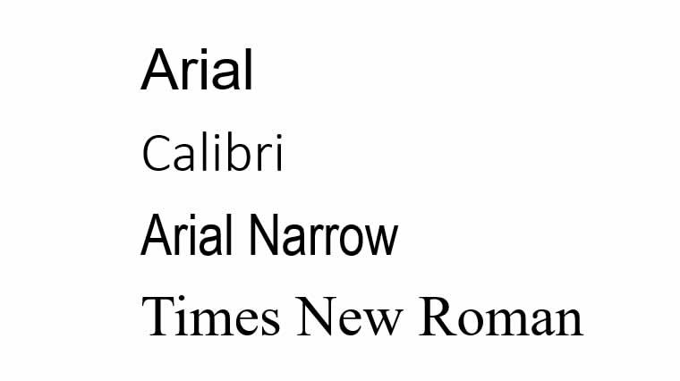
Arial, often considered a close cousin of Helvetica, was introduced by Microsoft in 1982. It features similar characteristics to Helvetica but has subtle differences in letterforms. Arial is widely used in digital and print media, particularly in Microsoft products, due to its legibility and compatibility across platforms.
- Times New Roman
Times New Roman is a classic serif typeface that originated in 1931. It is known for its elegant and readable design, making it a popular choice for formal documents, such as academic papers and newspapers. Times New Roman’s familiarity and association with tradition have contributed to its continued usage in various print and digital contexts.
- Calibri
Introduced as the default typeface in Microsoft Office in 2007, Calibri quickly gained popularity. This modern sans-serif typeface features a clean and simple design, making it suitable for both on-screen and print use. Calibri’s wide availability and contemporary appeal have made it a prevalent choice in business and professional settings.
- Arial Narrow
As a narrower version of Arial, Arial Narrow is often used when space is limited or a condensed appearance is desired. It shares the same characteristics as Arial but has narrower letterforms, making it suitable for presentations, headings, and tight layouts.
- Verdana
Verdana, designed by Matthew Carter for Microsoft in 1996, was created specifically for screen readability. This sans-serif typeface features wide proportions and generous spacing, making it highly legible even at small sizes. Verdana is often used in web design and digital interfaces.
- Georgia
Georgia is a serif typeface designed by Matthew Carter and released by Microsoft in 1996. It is specifically optimized for on-screen legibility, particularly at smaller sizes. Georgia’s elegant and readable design has made it a popular choice for web content, e-books, and other digital applications.
- Century Gothic
Century Gothic is a modern sans-serif typeface with geometric proportions and a clean design. Its rounded letterforms give it a contemporary look and make it suitable for a variety of applications, including branding, posters, and headlines. Century Gothic’s versatility and distinctive appearance have contributed to its widespread use.
- Tahoma
Introduced by Microsoft in 1994, Tahoma is a sans-serif typeface known for its clarity and legibility, even at smaller sizes. Its balanced letterforms and open counters make it suitable for both screen and print use. Tahoma is often used in user interfaces, presentations, and signage.
- Futura
Futura, designed by Paul Renner in the 1920s, is a geometric sans-serif typeface known for its clean and modern appearance. Its geometric shapes and minimal stroke variation give it a distinctive and timeless look. Futura is widely used in various design applications, including logos, advertising, and headlines.
These ten typefaces have achieved global recognition and have become go-to choices for many designers. Their versatility, readability, and aesthetic appeal have contributed to their widespread usage in a variety of contexts.

