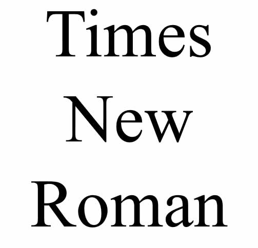
Times New Roman is a timeless and widely recognized typeface that has become a staple in the world of typography. Its origins can be traced back to the early 20th century when British newspaper tycoon, Lord Northcliffe, commissioned a new typeface for his newspaper, The Times. In this article, we will delve into the fascinating history of Times New Roman, its design influences, and its enduring popularity.

In 1929, The Times newspaper sought a new typeface that would address the legibility issues of the existing fonts used in newspaper printing. They turned to Stanley Morison, a typographer and design consultant, and Victor Lardent, a graphic artist, to create a modern and legible typeface specifically tailored for newspaper printing.
Morison and Lardent drew inspiration from an existing typeface called Plantin, a serif font designed by the renowned punch cutter Robert Granjon in the 16th century. They aimed to develop a typeface that retained the elegance and classic proportions of Plantin while optimizing it for the modern printing technology of the time.
The result was a transitional serif typeface with clear, sturdy letterforms and moderate contrast. Its design featured a vertical stress, slightly condensed letterforms, and prominent serifs. The typeface was named “Times New Roman” as a nod to its intended use in The Times newspaper.
Times New Roman made its debut in 1932 and quickly gained popularity for its readability and timeless aesthetic. Its neutral appearance and balanced proportions made it suitable for a wide range of applications beyond newspaper printing, including books, magazines, and digital media.
Throughout the years, Times New Roman has undergone slight modifications and variations, particularly in digital versions, to adapt to changing printing and display technologies. However, its core design principles have remained intact, maintaining its distinctive and recognizable characteristics.
The widespread adoption of Times New Roman can be attributed to its association with The Times newspaper and its subsequent inclusion in early computer operating systems. As personal computers became more prevalent in the 1980s and 1990s, Times New Roman became a default font choice for many word processing applications, further solidifying its ubiquity.
Today, Times New Roman continues to be a popular choice for various purposes, from academic papers and business documents to web content and signage. Its familiarity, legibility, and classic appeal make it a reliable and versatile typeface option.
In conclusion, the story of Times New Roman is one of innovation and enduring appeal. From its humble beginnings as a bespoke typeface for The Times newspaper to its widespread use in print and digital media, it has cemented its status as a classic and timeless typeface. Its balance of readability and elegance has made it a trusted choice for generations of designers, writers, and readers alike.
