Gothic fonts, also known as blackletter or Old English fonts, have a rich and fascinating history that spans several centuries. Evoking a sense of medieval charm and mystique, these typefaces have retained their allure and continue to be used in various design projects today. In this article, we will explore the unique characteristics of Gothic fonts, their advantages, disadvantages, and provide a curated list of contemporary Gothic fonts that maintain the essence of this captivating style.
Gothic Fonts: A Timeless Elegance
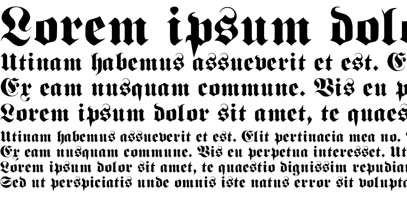
Gothic fonts originated in the Middle Ages and were commonly used in manuscripts, religious texts, and architectural inscriptions. These fonts are characterized by their intricate and ornate letterforms, featuring sharp edges, elongated vertical strokes, and decorative elements. Gothic fonts exude a sense of elegance, mystery, and historical depth, making them a popular choice for projects that seek to evoke a nostalgic or dramatic ambiance.

Advantages of Gothic Fonts:
Unique Aesthetic Appeal: Gothic fonts have a distinctive look that sets them apart from other typefaces. They add an air of sophistication and elegance to design compositions, making them ideal for logos, titles, and headings that require a bold and memorable appearance.
Strong Visual Impact: The intricate details and elaborate embellishments of Gothic fonts demand attention and leave a lasting impression on viewers. They can effectively convey a sense of tradition, authority, and timelessness.
Versatility: Despite their historical origins, Gothic fonts can be adapted to suit a wide range of design styles and themes. Whether it’s a vintage-inspired project, a gothic-themed event, or a modern brand seeking a unique visual identity, Gothic fonts offer versatility and adaptability.
Disadvantages of Gothic Fonts:
Readability Challenges: The ornate nature of Gothic fonts can sometimes hinder readability, especially in smaller sizes or when used for body text. The intricacies of the letterforms may cause letters to blend together or become difficult to distinguish, requiring careful consideration when selecting suitable applications.
Contextual Limitations: While Gothic fonts excel in certain design contexts, they may not be appropriate for all projects. Their historical connotations and dramatic appearance may clash with the visual identity or intended message of certain brands or designs.
Contemporary Gothic Fonts:
Fraktur: Inspired by traditional German blackletter scripts, Fraktur fonts evoke a sense of old-world charm and are commonly used in vintage-themed designs.
Cloister Black: Cloister Black features bold, condensed letterforms and is ideal for projects that require a gothic-inspired, mystical ambiance.
Blackmoor: Blackmoor is a modern take on traditional blackletter fonts, combining historical elements with a contemporary twist. It is a versatile font suitable for both display and body text.
Conclusion:
Gothic fonts continue to captivate designers and audiences alike with their timeless elegance and historical appeal. Despite their intricacies and potential readability challenges, Gothic fonts offer a unique aesthetic that can elevate design compositions to new heights. By carefully selecting appropriate applications and considering readability, Gothic fonts can create a striking visual impact and evoke a sense of tradition and sophistication.
In the contemporary design landscape, Gothic fonts have found their place in a variety of projects, from branding and packaging to invitations and editorial design. Their ability to transcend time and convey a sense of nostalgia, mystery, and authority makes them a valuable tool for designers seeking to create visually compelling and memorable experiences.
When exploring Gothic fonts for your projects, consider the advantages and disadvantages, ensuring that the font aligns with the intended message and visual identity. Embrace the elegance and charm of Gothic fonts while balancing readability and context to create captivating designs that stand the test of time.

