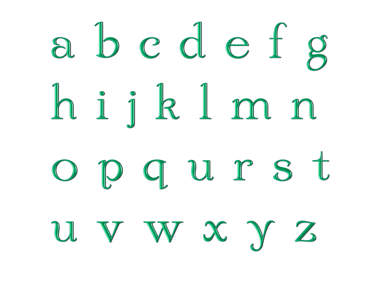
Typography is an art form that involves arranging and designing letters to create visually appealing and effective communication. To truly appreciate and master typography, it is essential to have a solid understanding of the anatomy of letters. Each letter is composed of distinct parts that contribute to its unique form and overall visual impact. In this article, we will explore the key components that make up the anatomy of letters, delving into their significance and influence in typography.
Baseline: The Foundation of Letterforms
The baseline is the imaginary line on which most letters rest. It provides a consistent reference point for aligning letters and maintaining visual stability within a line of text. The baseline serves as a foundation for letterforms and helps establish a sense of order and structure in typography.
Stem: The Backbone of Letterforms
The stem is the main vertical stroke of a letter. It is typically the primary stroke that gives the letter its distinctive shape. The stem can vary in thickness, taper, or curvature, depending on the specific letter and typeface. It provides the backbone and stability of the letterform.
Ascenders: Adding Elegance and Variation
The ascender refers to the part of a lowercase letter that extends above the x-height. It includes the vertical strokes that rise above the main body of the letter, such as the tops of lowercase letters like “b,” “d,” or “h.” The ascenders add elegance and variation to letterforms, contributing to the overall visual rhythm of typography.
Descenders: Creating Balance and Personality
The descender is the portion of a lowercase letter that extends below the baseline. It consists of the vertical strokes that descend below the main body of the letter, such as the tails of lowercase letters like “g,” “j,” or “p.” Descenders add balance, personality, and rhythm to the letterforms, creating a harmonious interplay between ascenders and descenders.
Serif vs. Sans-serif: Traditional vs. Modern Aesthetics
Serifs are small decorative strokes or lines attached to the end of a letter’s main strokes. They can be classified as either “serif” or “sans-serif” based on the presence or absence of these embellishments. Serifs are commonly found in typefaces classified as “serif,” and they add sophistication, tradition, and readability to the letterforms. Sans-serif typefaces, on the other hand, lack serifs and convey a more modern, clean, and minimalistic aesthetic.
Counter: Differentiating Positive and Negative Space
The counter refers to the partially or fully enclosed space within a letter. It is the negative space surrounded by the letter’s main strokes. The counter contributes to the overall legibility of a letter by providing clear differentiation between positive and negative spaces. It also plays a crucial role in distinguishing similar letters, such as “O” and “Q,” or “C” and “G.”
X-height: Balancing Size and Proportion
The x-height is the height of the lowercase letters, typically excluding ascenders and descenders. It is measured from the baseline to the top of the lowercase letters that do not extend beyond the x-height, such as “a,” “e,” or “n.” The x-height is an essential factor in determining the overall visual balance and readability of a typeface. It influences the perceived size, weight, and proportion of the letters within a text.
Conclusion: The Art and Science of Typography
Understanding the anatomy of letters is fundamental to the art and science of typography. Each component, from the baseline and stem to the ascenders, descenders, serifs, counter, and x-height, contributes to the overall visual impact and legibility of a typeface. By appreciating and mastering the anatomy of letters, designers and typographers can create harmonious and effective typography that communicates messages with clarity, aesthetics, and visual impact. So, next time you encounter a typeface, take a moment to appreciate the intricate details and thoughtful design choices that shape the letters and ultimately influence our reading experience.
